> ## Documentation Index
> Fetch the complete documentation index at: https://docs.summation.com/llms.txt
> Use this file to discover all available pages before exploring further.
# Dashboards
> Live dashboards of your data — charts, KPIs, tables, and filters on a bento-grid canvas.
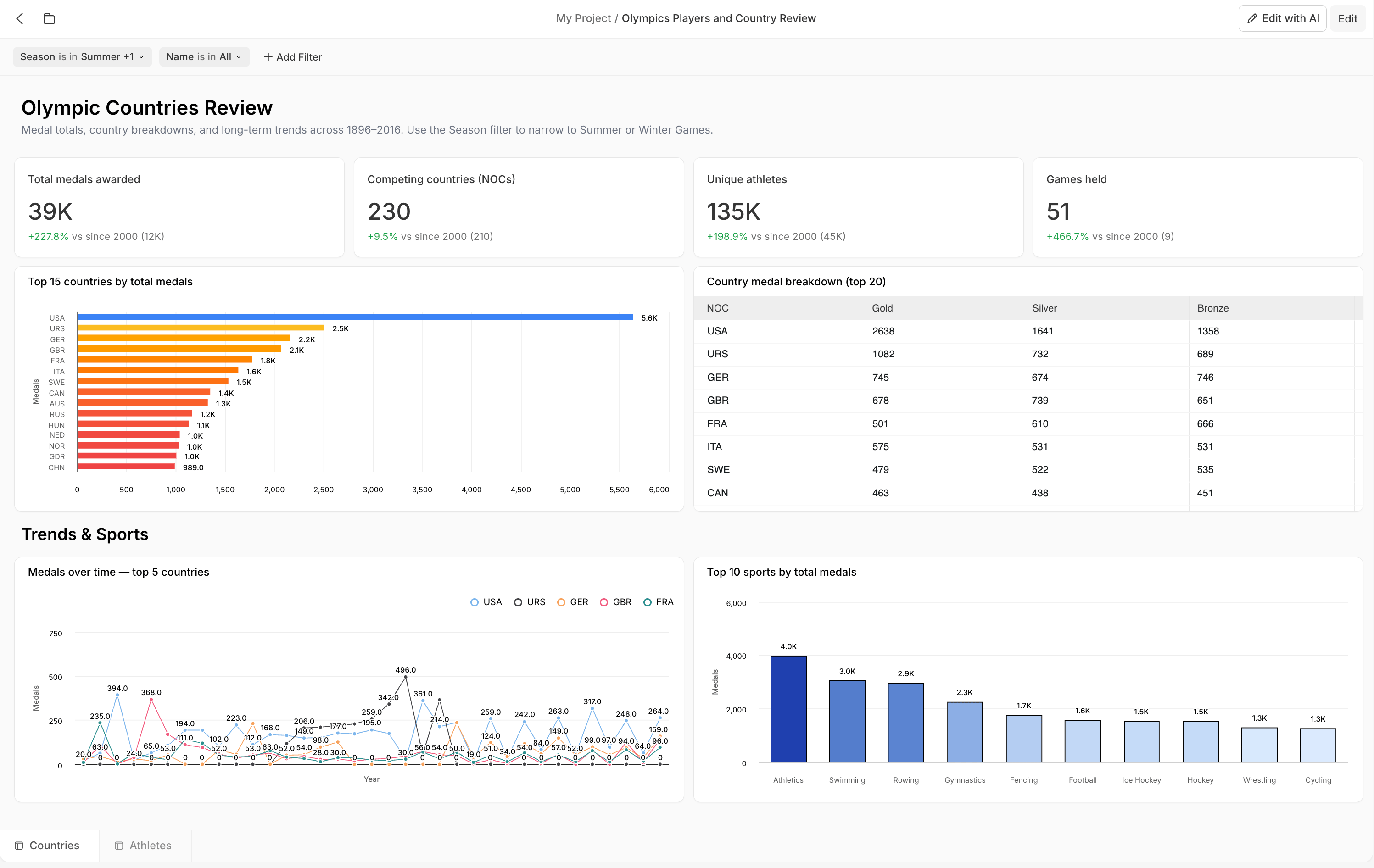
A **dashboard** (`.sdash`) is a live, interactive view of your data — a bento-grid canvas of **cards** (charts, KPIs, tables, and more) that stays up to date as the underlying data changes. A dashboard can hold multiple **tabs**, each its own canvas of cards. Dashboards are an [artifact](/features/artifacts) and live inside a [project](/features/projects).
 **Where each action lives in the UI** (for telling users where to click):
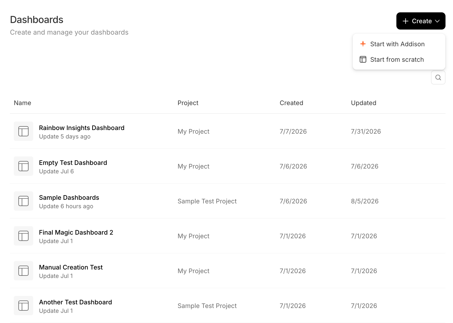
* **Dashboards home**: the **Dashboards** entry in the left nav sidebar (`/dashboards`) — a table of your dashboards across all projects, with **Search**, a **Create** menu (Start with Addison / Start from scratch), and a per-row **⋯** menu (Open in new tab, Rename, Duplicate, Delete).
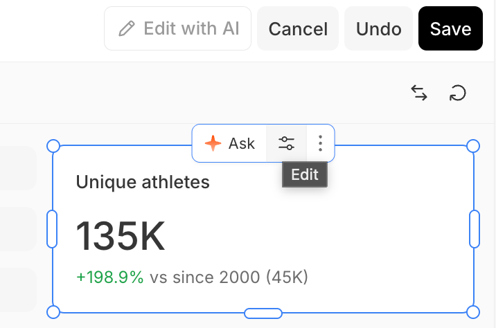
* **Dashboard editor** (`/projects/{projectId}/dashboards/{dashboardId}`): an **Edit** button enters edit mode — a card palette in the toolbar (**Add Chart / Table / KPI / Text**, plus **Data Sources**) that you drag onto the grid, move/resize handles, a right-rail **card config pane**, and **Save / Cancel / Undo**. An **Edit with AI** button enters AI-edit mode. A **filter bar** sits above the grid.
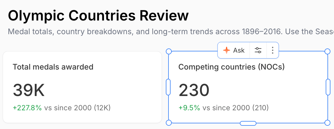
* **Per card**: select a card for a small toolbar (it shows only while the card is selected and no popover is open). Its buttons depend on mode — **view mode**: **Ask**, **Edit with AI**, **More** (export image / data); **edit mode**: **Ask**, **Edit** (opens the config pane), **More**. There is no gear icon.
* **Not in the public API**: dashboards are managed in the app only. A dashboard's `.sdash` is a **folder package** (a directory on disk with a single file ID), reachable generically through the [files API](/features/projects/files), but there are no dashboard-specific public endpoints yet.
Dashboard surfaces are gated by feature flags — `ui_dashboards_nav` (home + create), `ui_dashboards_edit_mode` (edit mode / Save), `ui_dashboards_ai_actions` (per-card Ask / Edit with AI), and `ui_dashboards_debug` (JSON editor). They are currently **on for everyone**, but they are flag-gated: if a workspace has one off, that part of the UI won't appear.
## Create a dashboard
Start a dashboard from **Dashboards** (`/dashboards`) → **Create** (top-right), from a project's **Create → Dashboard**, or from the editor's empty state. Two ways to build it:
* **Start with Addison** — describe what you want (e.g. "Revenue by region", "Headcount trends") and Addison assembles the dashboard, streaming it live, the same way it [creates a report](/features/artifacts/reports#create-a-report).
* **Start from scratch** — a blank canvas you build yourself, card by card.
**Where each action lives in the UI** (for telling users where to click):
* **Dashboards home**: the **Dashboards** entry in the left nav sidebar (`/dashboards`) — a table of your dashboards across all projects, with **Search**, a **Create** menu (Start with Addison / Start from scratch), and a per-row **⋯** menu (Open in new tab, Rename, Duplicate, Delete).
* **Dashboard editor** (`/projects/{projectId}/dashboards/{dashboardId}`): an **Edit** button enters edit mode — a card palette in the toolbar (**Add Chart / Table / KPI / Text**, plus **Data Sources**) that you drag onto the grid, move/resize handles, a right-rail **card config pane**, and **Save / Cancel / Undo**. An **Edit with AI** button enters AI-edit mode. A **filter bar** sits above the grid.
* **Per card**: select a card for a small toolbar (it shows only while the card is selected and no popover is open). Its buttons depend on mode — **view mode**: **Ask**, **Edit with AI**, **More** (export image / data); **edit mode**: **Ask**, **Edit** (opens the config pane), **More**. There is no gear icon.
* **Not in the public API**: dashboards are managed in the app only. A dashboard's `.sdash` is a **folder package** (a directory on disk with a single file ID), reachable generically through the [files API](/features/projects/files), but there are no dashboard-specific public endpoints yet.
Dashboard surfaces are gated by feature flags — `ui_dashboards_nav` (home + create), `ui_dashboards_edit_mode` (edit mode / Save), `ui_dashboards_ai_actions` (per-card Ask / Edit with AI), and `ui_dashboards_debug` (JSON editor). They are currently **on for everyone**, but they are flag-gated: if a workspace has one off, that part of the UI won't appear.
## Create a dashboard
Start a dashboard from **Dashboards** (`/dashboards`) → **Create** (top-right), from a project's **Create → Dashboard**, or from the editor's empty state. Two ways to build it:
* **Start with Addison** — describe what you want (e.g. "Revenue by region", "Headcount trends") and Addison assembles the dashboard, streaming it live, the same way it [creates a report](/features/artifacts/reports#create-a-report).
* **Start from scratch** — a blank canvas you build yourself, card by card.
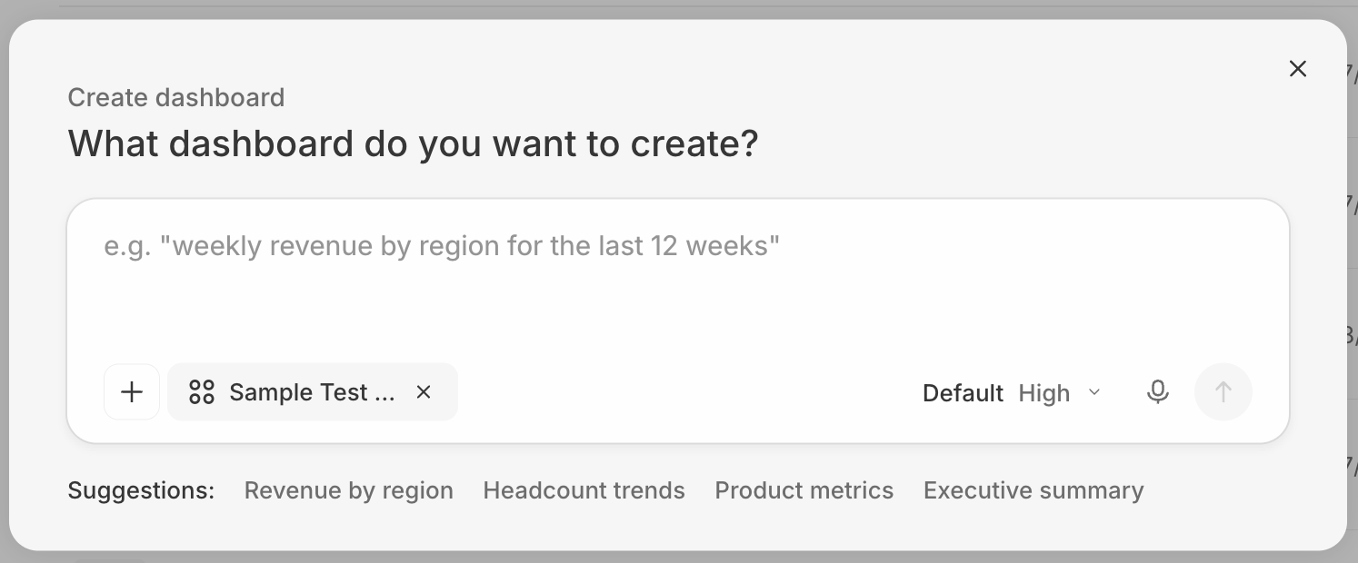
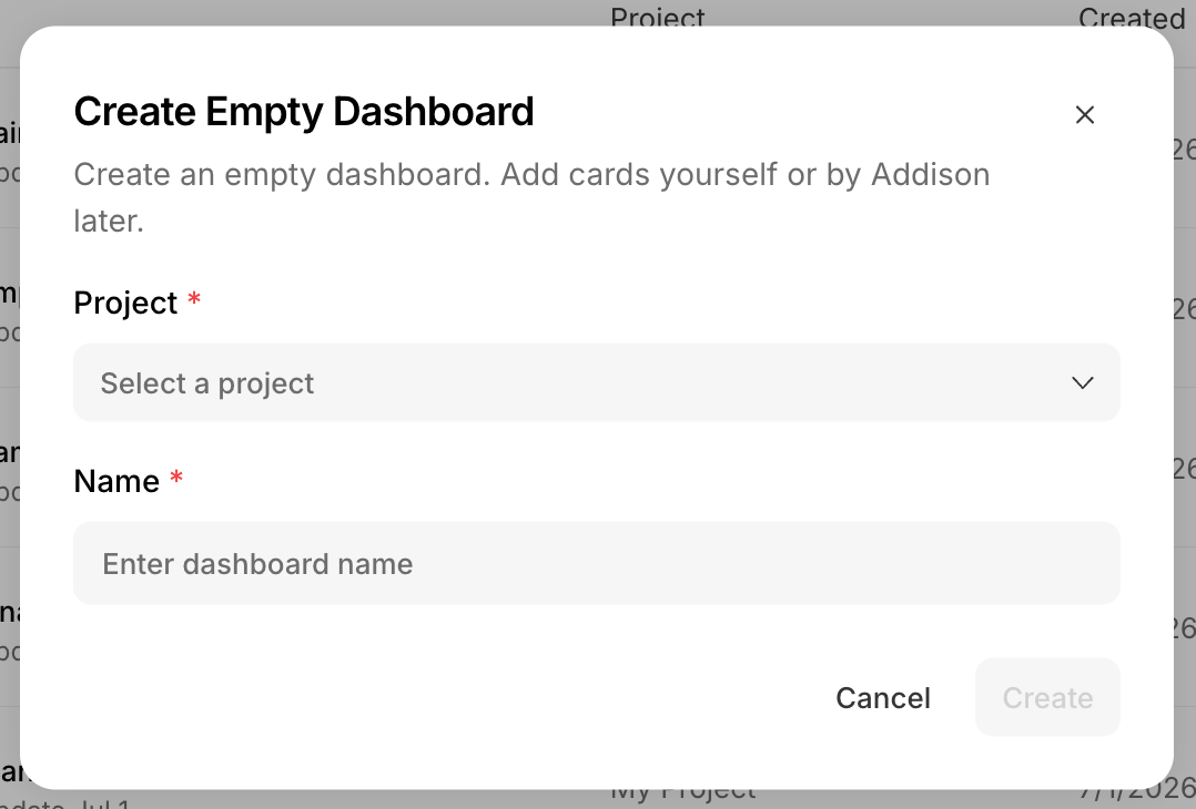 **Two more ways:** from a project's **Create → Dashboard** (see [Create artifacts from project](/features/projects#create-artifacts-from-project)), or by **asking Addison in a chat** (see [Creating artifacts](/features/artifacts#creating-artifacts)).
Generate a dashboard from a prompt.
## Find and open dashboards
The **Dashboards** page (`/dashboards`, shown above) lists your dashboards across all projects (Name, Project, Created, Updated) with search. Click one to open its editor. Dashboards are `.sdash` **folder packages**, so they also appear in their project's [file browser](/features/projects/files).
List a project's dashboards and show a single dashboard.
## Data sources
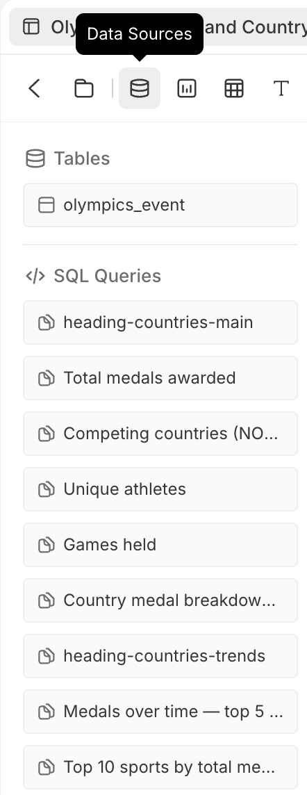
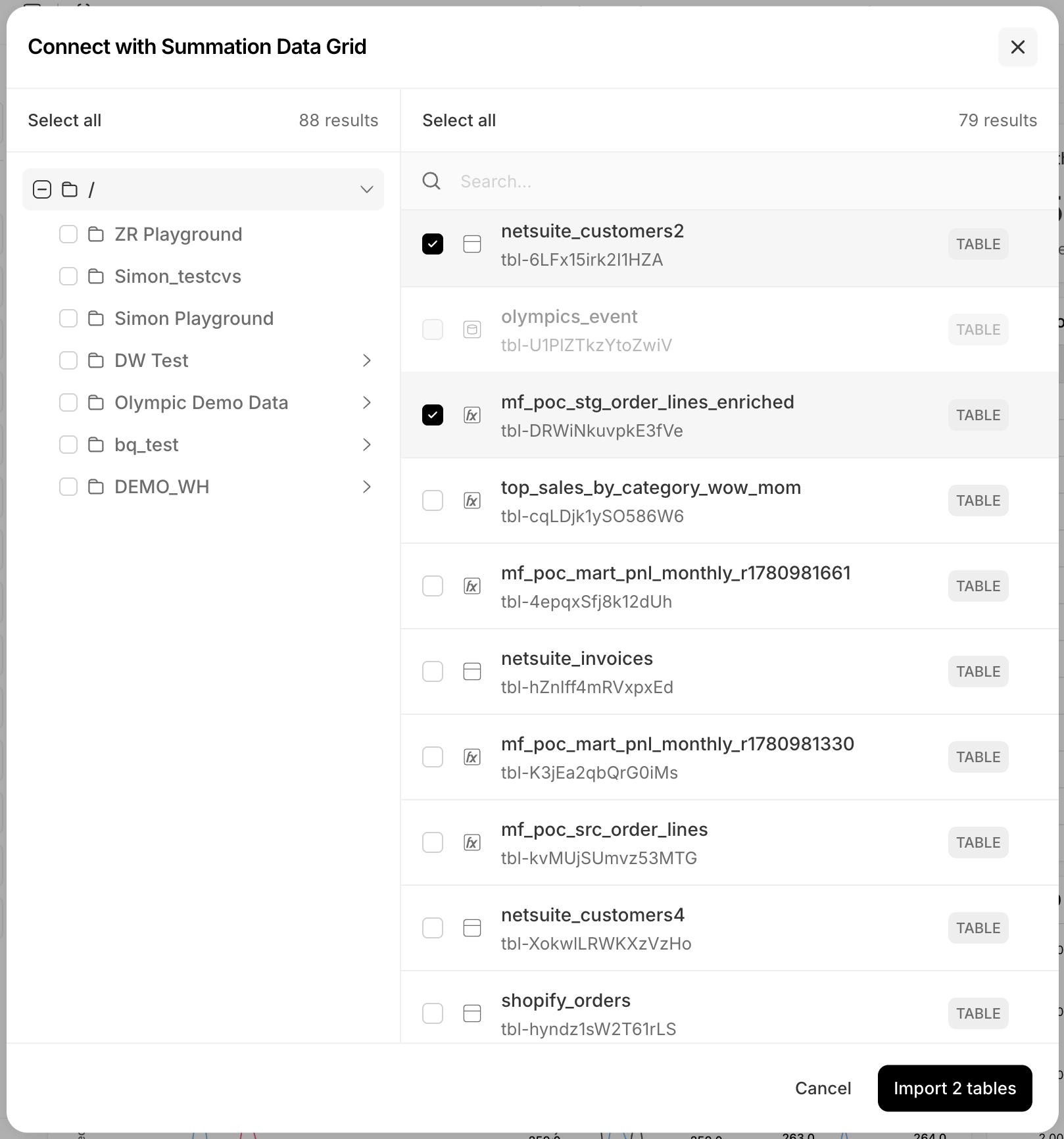
A dashboard's **data sources** are the data tables it draws from. Open the **Data Sources** panel in the edit toolbar to add and manage them; it lists them under **Tables** and **SQL Queries**. Every data source you add becomes a selectable option when you configure a card's data, and its columns become available as [filter](#filters) options.
**Two more ways:** from a project's **Create → Dashboard** (see [Create artifacts from project](/features/projects#create-artifacts-from-project)), or by **asking Addison in a chat** (see [Creating artifacts](/features/artifacts#creating-artifacts)).
Generate a dashboard from a prompt.
## Find and open dashboards
The **Dashboards** page (`/dashboards`, shown above) lists your dashboards across all projects (Name, Project, Created, Updated) with search. Click one to open its editor. Dashboards are `.sdash` **folder packages**, so they also appear in their project's [file browser](/features/projects/files).
List a project's dashboards and show a single dashboard.
## Data sources
A dashboard's **data sources** are the data tables it draws from. Open the **Data Sources** panel in the edit toolbar to add and manage them; it lists them under **Tables** and **SQL Queries**. Every data source you add becomes a selectable option when you configure a card's data, and its columns become available as [filter](#filters) options.
 Data sources come in two kinds:
* **View data sources** are backed by Summation's **view layer** — a structured, declarative definition of a card's data (its tables, columns, filters, and aggregations) that the config pane can read and edit. Summation built it so cards can be configured and filtered in the UI without writing SQL. Cards you add and configure manually use a view data source by default.
* **SQL data sources** run a raw query that **bypasses the view layer** — more flexible, but less human-configurable. Addison can generate both and tends to use SQL most of the time. On a card backed by a SQL data source you can still edit the **Card Type**, **Title**, **Style**, and its **Filter behavior**; only the underlying query is off-limits (the **Data Source** row is marked **Read Only**), so only Addison can change what data it returns.
Add and manage a dashboard's data sources.
## Cards
A dashboard is a grid of **cards**:
| Card | What it shows |
| -------------------- | -------------------------------------------------------------------------------------------------------------------------------------------------- |
| **KPI** | A single metric, optionally with a comparison |
| **Chart** | Bar, Line, Pie, Waterfall, Combo, Box plot, or Bullet |
| **Table** | Tabular data |
| **Text** | Narrative and commentary |
| **Heading** | Section labels |
| **Financial report** | A formatted financial statement. Not in the drag-and-drop palette (Addison adds it), but an existing one is fully configurable as a **Card Type**. |
## Build and edit
Click **Edit** to enter edit mode, then:
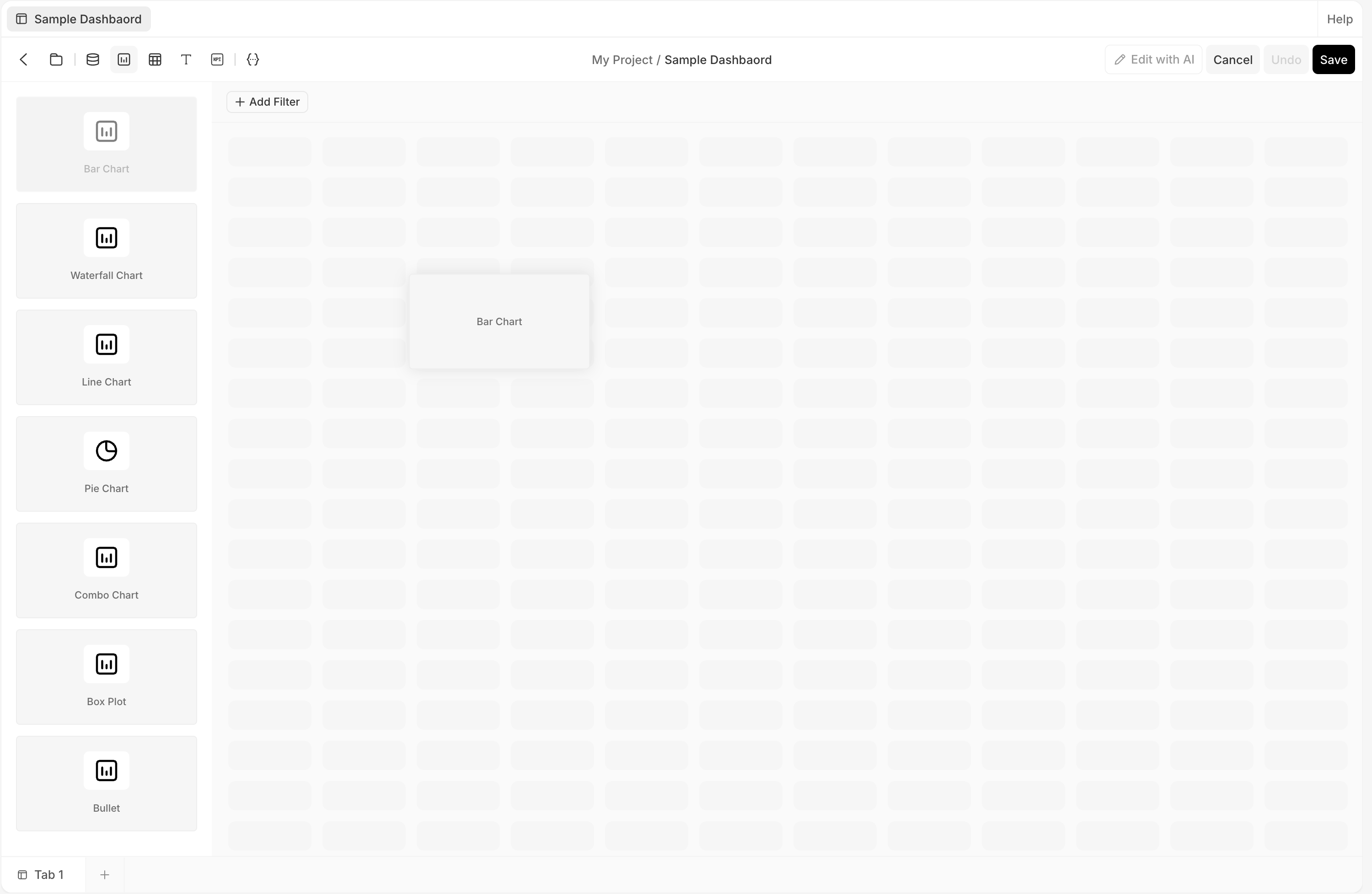
* **Add cards** — open a palette from the toolbar (**Add Chart / Table / KPI / Text**, plus **Data Sources**) and **drag a card onto the grid**. Dropping a card **auto-sources** its data and **auto-configures** it with the best-matching setup; you can also drag a data-source table straight onto the grid to build a chart from it. Cards you add manually always use a **view config** (backed by a data view).
* **Arrange** — drag to move and use the resize handles; the layout is a 12-column bento grid.
* **Act on a card** — select a card to reveal its toolbar (**Ask**, **Edit**, and **⋯**); **Edit** opens the [config pane](#configure-a-card).
* **Save** — edits are saved explicitly with **Save**; **Undo** and **Cancel** (discard) are available.
Data sources come in two kinds:
* **View data sources** are backed by Summation's **view layer** — a structured, declarative definition of a card's data (its tables, columns, filters, and aggregations) that the config pane can read and edit. Summation built it so cards can be configured and filtered in the UI without writing SQL. Cards you add and configure manually use a view data source by default.
* **SQL data sources** run a raw query that **bypasses the view layer** — more flexible, but less human-configurable. Addison can generate both and tends to use SQL most of the time. On a card backed by a SQL data source you can still edit the **Card Type**, **Title**, **Style**, and its **Filter behavior**; only the underlying query is off-limits (the **Data Source** row is marked **Read Only**), so only Addison can change what data it returns.
Add and manage a dashboard's data sources.
## Cards
A dashboard is a grid of **cards**:
| Card | What it shows |
| -------------------- | -------------------------------------------------------------------------------------------------------------------------------------------------- |
| **KPI** | A single metric, optionally with a comparison |
| **Chart** | Bar, Line, Pie, Waterfall, Combo, Box plot, or Bullet |
| **Table** | Tabular data |
| **Text** | Narrative and commentary |
| **Heading** | Section labels |
| **Financial report** | A formatted financial statement. Not in the drag-and-drop palette (Addison adds it), but an existing one is fully configurable as a **Card Type**. |
## Build and edit
Click **Edit** to enter edit mode, then:
* **Add cards** — open a palette from the toolbar (**Add Chart / Table / KPI / Text**, plus **Data Sources**) and **drag a card onto the grid**. Dropping a card **auto-sources** its data and **auto-configures** it with the best-matching setup; you can also drag a data-source table straight onto the grid to build a chart from it. Cards you add manually always use a **view config** (backed by a data view).
* **Arrange** — drag to move and use the resize handles; the layout is a 12-column bento grid.
* **Act on a card** — select a card to reveal its toolbar (**Ask**, **Edit**, and **⋯**); **Edit** opens the [config pane](#configure-a-card).
* **Save** — edits are saved explicitly with **Save**; **Undo** and **Cancel** (discard) are available.
 Read and update a dashboard's cards and layout.
## Configure a card
Select a card in edit mode and open its **config pane** (the right rail) from the card's **Edit** button. The pane has three tabs:
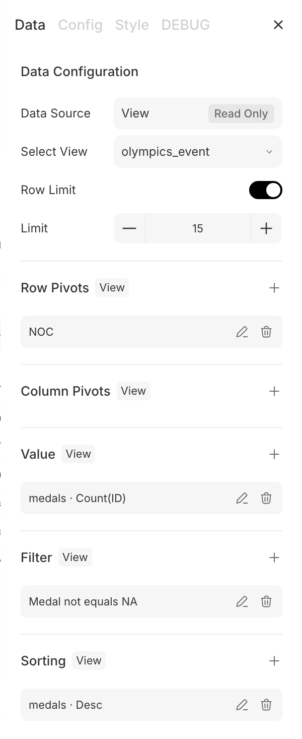
* **Data** — the data source (a view) and how it's shaped: **Select View**, row and column pivots, value, filter, and sorting.
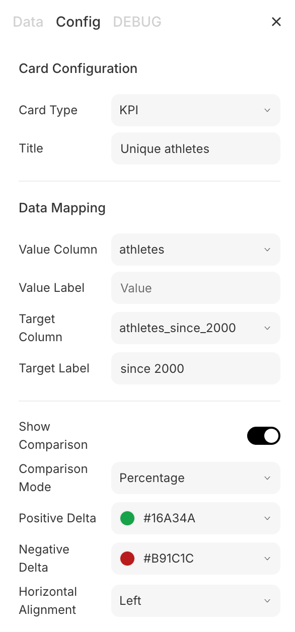
* **Config** — the card itself: **Card Type**, title, data mapping (value column, comparison), and number format.
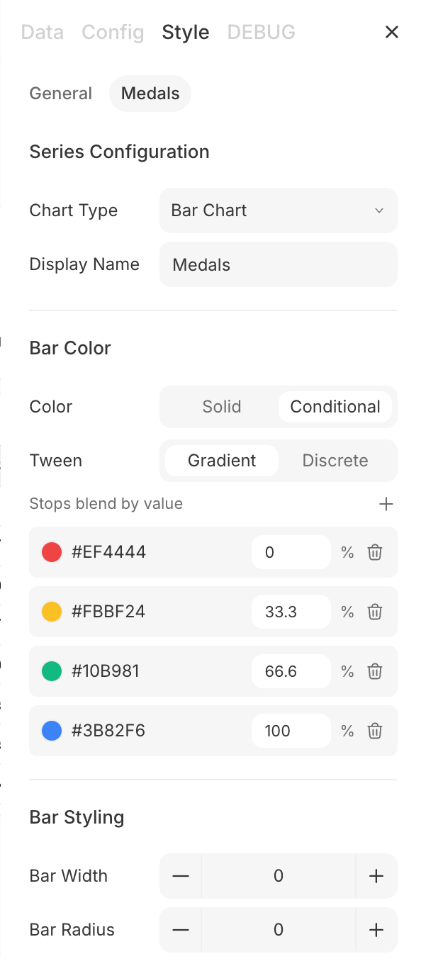
* **Style** — presentation: title, color scheme, orientation, legend, axes, and formats (for chart and non-pivoted table cards).
Cards on a **view** data source are fully editable. On a card on a [SQL data source](#data-sources), only the **Data Source** row of the **Data** tab is marked **Read Only** (only Addison can change its query); the tab still exposes an editable **Filter behavior** control, and the card's **Config** (Card Type, Title) and **Style** stay editable.
Read and update a dashboard's cards and layout.
## Configure a card
Select a card in edit mode and open its **config pane** (the right rail) from the card's **Edit** button. The pane has three tabs:
* **Data** — the data source (a view) and how it's shaped: **Select View**, row and column pivots, value, filter, and sorting.
* **Config** — the card itself: **Card Type**, title, data mapping (value column, comparison), and number format.
* **Style** — presentation: title, color scheme, orientation, legend, axes, and formats (for chart and non-pivoted table cards).
Cards on a **view** data source are fully editable. On a card on a [SQL data source](#data-sources), only the **Data Source** row of the **Data** tab is marked **Read Only** (only Addison can change its query); the tab still exposes an editable **Filter behavior** control, and the card's **Config** (Card Type, Title) and **Style** stay editable.
 Configure a card's data, options, and style.
## Ask and edit with Addison
Dashboards aren't edited by typing. Select a card for its toolbar and pick:
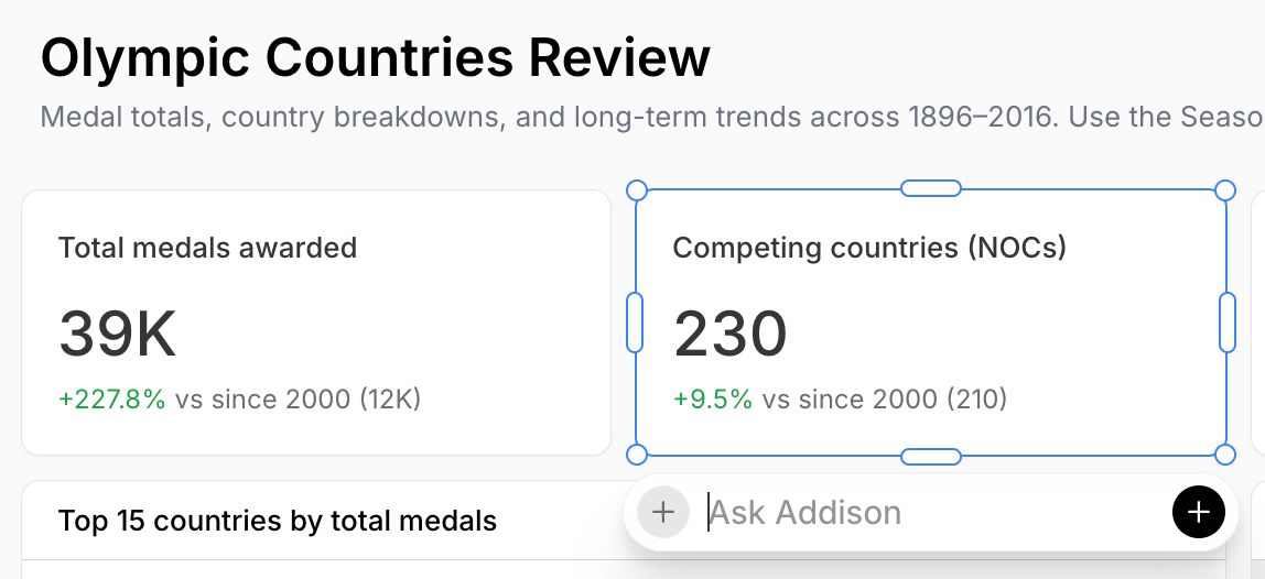
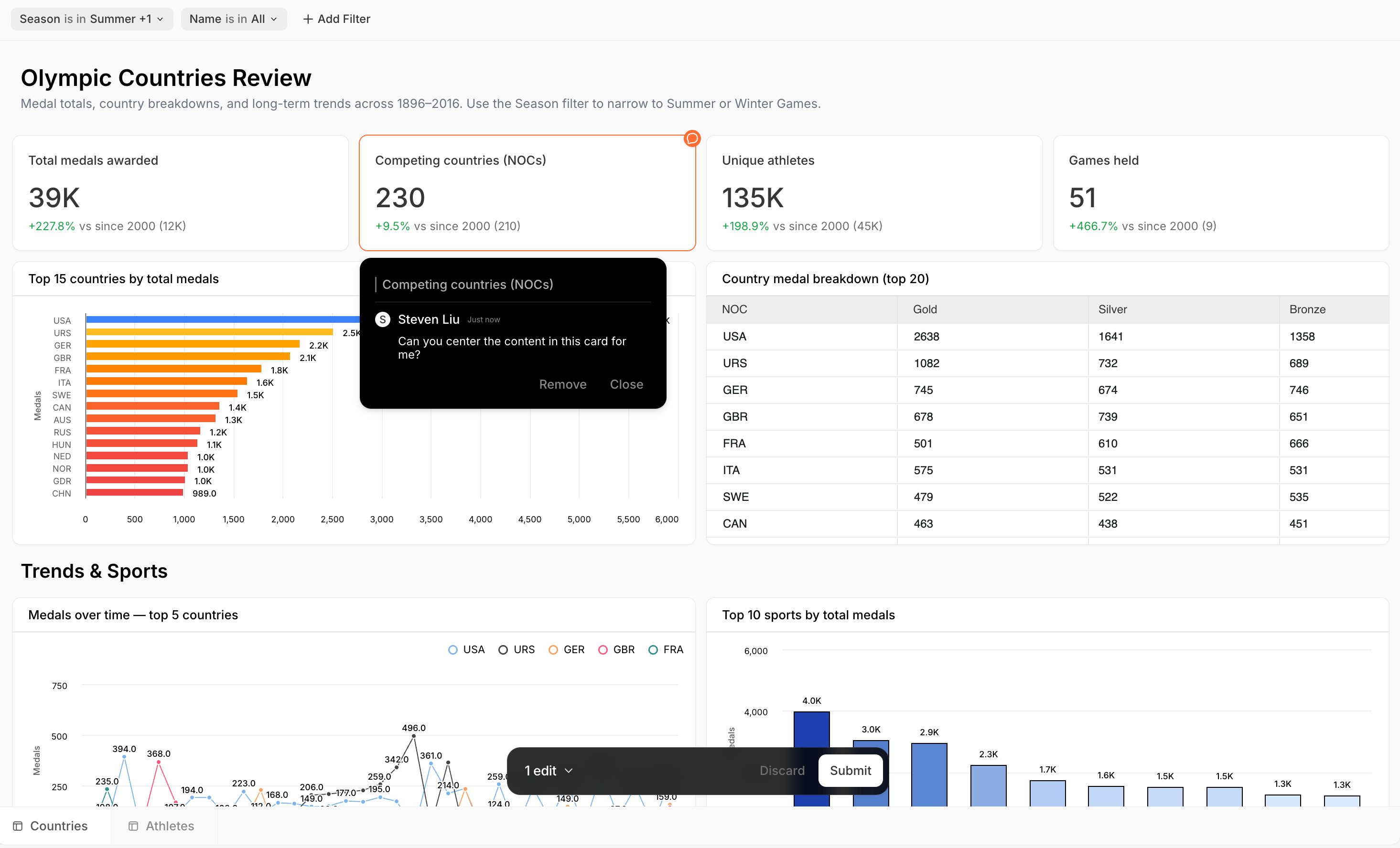
* **Ask** — ask Addison a question about that card; the answer streams in the chat pane.
* **Edit with AI** — enter AI-edit mode, then select cards and **describe the change** you want. Edits queue in a bar ("N edits"), and **Submit** sends them to Addison as one request, which applies them to the dashboard.
Configure a card's data, options, and style.
## Ask and edit with Addison
Dashboards aren't edited by typing. Select a card for its toolbar and pick:
* **Ask** — ask Addison a question about that card; the answer streams in the chat pane.
* **Edit with AI** — enter AI-edit mode, then select cards and **describe the change** you want. Edits queue in a bar ("N edits"), and **Submit** sends them to Addison as one request, which applies them to the dashboard.
 Ask Addison and apply edits to a dashboard.
## Filters
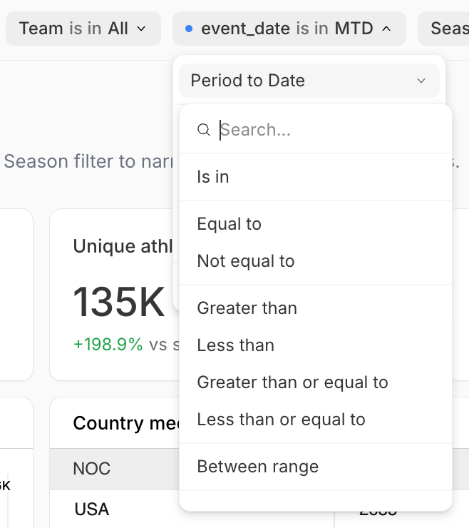
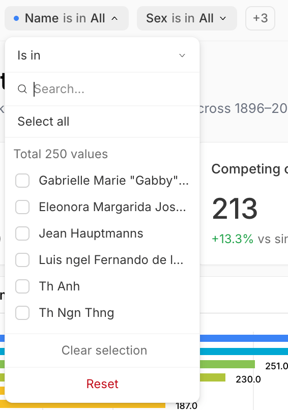
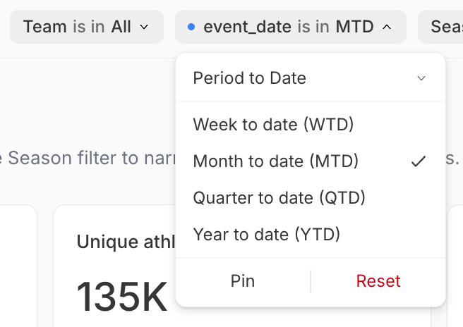
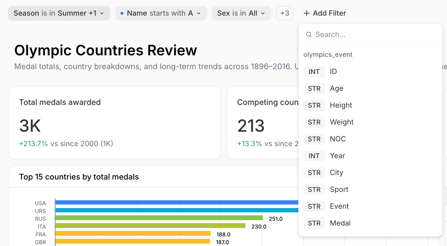
A **filter bar** above the grid filters every card at once. Click **Add Filter**, pick a column, then choose an operator and values. See [Appendix B](#appendix-b-dashboard-filters) for filter types and operators. Filters behave differently in the two modes:
* **View mode** — apply a **temporary** filter for exploration. It shows a **blue dot** in front and lasts for your session; to keep it, switch to **edit mode** and **Save**. The bar collapses overflow filters into a **+N** dropdown.
* **Edit mode** — add, remove, and **Pin** filters (a pinned filter stays out front and isn't collapsed). The **reorder** button at the right of the bar rearranges filters; pinned filters reorder only among pinned, and unpinned only among unpinned. **Save** to persist.
* **Cross-filtering** — click a data point in a chart to filter the other cards to that selection.
Ask Addison and apply edits to a dashboard.
## Filters
A **filter bar** above the grid filters every card at once. Click **Add Filter**, pick a column, then choose an operator and values. See [Appendix B](#appendix-b-dashboard-filters) for filter types and operators. Filters behave differently in the two modes:
* **View mode** — apply a **temporary** filter for exploration. It shows a **blue dot** in front and lasts for your session; to keep it, switch to **edit mode** and **Save**. The bar collapses overflow filters into a **+N** dropdown.
* **Edit mode** — add, remove, and **Pin** filters (a pinned filter stays out front and isn't collapsed). The **reorder** button at the right of the bar rearranges filters; pinned filters reorder only among pinned, and unpinned only among unpinned. **Save** to persist.
* **Cross-filtering** — click a data point in a chart to filter the other cards to that selection.
 Read and set a dashboard's filters.
## Download
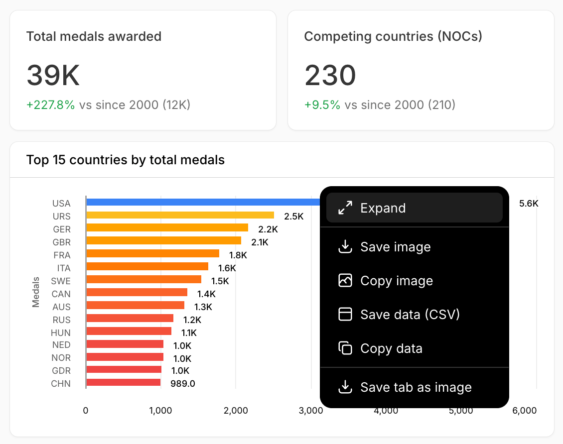
Dashboards download at the **card level**: from a card's **More** (⋯) menu, **Save image** / **Copy image** (PNG) or **Save data** / **Copy data** (CSV). You can also **Save the whole tab as an image**. Dashboard-wide PDF export isn't available yet.
Read and set a dashboard's filters.
## Download
Dashboards download at the **card level**: from a card's **More** (⋯) menu, **Save image** / **Copy image** (PNG) or **Save data** / **Copy data** (CSV). You can also **Save the whole tab as an image**. Dashboard-wide PDF export isn't available yet.
 Export a dashboard or its cards.
## Rename, duplicate, and delete
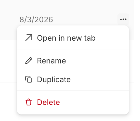
A dashboard is a `.sdash` **folder package** (a directory on disk with a single file ID). Rename, duplicate, or delete it from the [file browser](/features/projects/files#manage-a-file)'s **⋯** menu, or from the row **⋯** on the Dashboards page (Open in new tab, Rename, Duplicate, Delete). Deleting can't be undone.
Export a dashboard or its cards.
## Rename, duplicate, and delete
A dashboard is a `.sdash` **folder package** (a directory on disk with a single file ID). Rename, duplicate, or delete it from the [file browser](/features/projects/files#manage-a-file)'s **⋯** menu, or from the row **⋯** on the Dashboards page (Open in new tab, Rename, Duplicate, Delete). Deleting can't be undone.
 Rename, duplicate, and delete a dashboard.
## Share and publish
Publishing a dashboard as a view-only link isn't available yet. For now, dashboards are viewed in the app by [project collaborators](/features/projects#collaborators). (Reports do support [publishing](/features/artifacts/reports#share-and-publish).)
Publish and share a dashboard.
## Appendix A: configurable options by card type
Everything below is set in the [card config pane](#configure-a-card). All data-backed cards share the same **Data** tab and some common **Config** controls; the per-type specifics follow.
View-backed cards:
| Option | Values / notes |
| ---------------------------------- | ----------------------------------------------------------------------------------------------------------------------------------------------------------------------------------------------------------------------------- |
| **Select View** | The data source |
| **Row Limit** | Toggle, plus a row count |
| **Row Pivots** / **Column Pivots** | Group-by and pivot columns |
| **Value** | Column, aggregation (Sum / Count / Average / Min / Max / Median / Distinct count), and alias |
| **Filter** | Column, operator (Equals, Not equals, Greater than, Greater than or equal, Less than, Less than or equal, Is one of, Is not one of, Between, Contains, Starts with, Ends with, Is null, Is not null), value, case-insensitive |
| **Sorting** | A column or aggregation, Ascending / Descending |
SQL-backed cards instead show **Filter behavior** (Replace or Intersect) — how tab filters combine with the card's own query.
| Option | Values / notes |
| ----------------- | ------------------------------------------------------------- |
| **Card Type** | Chart / KPI / Table / Financial Report / Text / Heading |
| **Title** | Text |
| **Show Header** | Toggle (not on KPI or Heading) |
| **Card Position** | X, Y, Width, Height |
| **Type** | Read-only badge on Table / Financial report (Pivoted or Flat) |
Config tab (no Style tab):
| Option | Values / notes |
| ------------------------ | ------------------------------ |
| **Value Column** | Column |
| **Value Label** | Text |
| **Target Column** | Column (optional) |
| **Target Label** | Text (when a target is set) |
| **Show Comparison** | Toggle (needs a target) |
| **Comparison Mode** | Percentage / Absolute |
| **Horizontal Alignment** | Left / Center |
| **Format** | Number / Currency / Percentage |
| **Decimal Places** | 0–4 |
| **Currency Symbol** | Text (when Currency) |
| **Rounding** | Round / Floor / Ceil |
**Config (data mapping)**
| Option | Values / notes |
| ------------------ | --------------------------------------------------------------------------------------------------------------------- |
| **X Field** | Category column |
| **Y Columns** | Add, reorder, recolor, or remove each series |
| **Derived series** | Rolling Average / Trendline / Moving Median / Exponential Smoothing, with a parameter (Window Size, Degree, or Alpha) |
**Style → General**
| Option | Values / notes |
| ---------------- | ------------------------------------------------------------------------------------------------------------------------------ |
| **Title** | Text |
| **Color Scheme** | Default / Monochrome / Vibrant / Earth Tones / Cool Blues |
| **Orientation** | Horizontal / Vertical |
| **Stacking** | None / Normal / Percent |
| **Background** | Color |
| **Show Legend** | Toggle |
| **Y-Axis** | Title, Show Title, Min / Max, Tick Interval (Auto / 1 / 5 / 10 / 50 / 100), Format, Decimals, Prefix, Suffix, Show Label |
| **X-Axis** | Title, Show Title, Format (date, number, currency, percentage, compact, custom, or text case), Show Label |
| **Annotations** | Bands (Fixed values / Percentile / Std deviation / Control limits / Custom) and Highlights (conditional, with color and label) |
**Style → per series**
| Option | Values / notes |
| ---------------- | --------------------------------------------------------------------------------------------------------------- |
| **Chart Type** | Line / Bar / Area / Scatter / Waterfall / Pie / Bullet / Box Plot (mix types for a combo chart) |
| **Display Name** | Text |
| **Styling** | Colors, line/bar width, symbol and radius, axis side (Left / Right), pie labels, bullet targets, box-plot stats |
| **Data Label** | Toggle, format, decimals, rounding, colors |
**Config** (flat tables; hidden when pivoted)
| Option | Values / notes |
| ----------- | ------------------------------------------------------ |
| **Columns** | Add, reorder, **Pin** (None / Left / Right), or remove |
**Style** (flat tables only, per column)
| Option | Values / notes |
| ---------- | ------------------------------------- |
| **Header** | Text |
| **Format** | Auto / Number / Currency / Percentage |
| **Width** | Pixels |
**Config** (hidden when pivoted)
| Option | Values / notes |
| -------------------- | ----------------------- |
| **Columns** | Add, reorder, or remove |
| **Show Subtotals** | Toggle |
| **Show Grand Total** | Toggle |
**Style** (flat reports only, per column)
| Option | Values / notes |
| ----------------------- | --------------------------------------------------------------- |
| **Type** | Label / Text / Numeric / Currency / Percentage / Percentage Bar |
| **Display Name** | Text |
| **Currency** | When Type = Currency |
| **Width** | Pixels |
| **Prefix** / **Suffix** | Text |
| **Decimals** | 0–8 |
| **Colorize Sign** | Toggle |
Config only (no Data or Style tab):
| Option | Values / notes |
| ------------------------------------- | ---------------------- |
| **Body Heading** | Text |
| **Body** | Text |
| **Horizontal** | Left / Center / Right |
| **Vertical** | Top / Center / Bottom |
| **Font Size** | 10–48 |
| **Font Weight** | Normal / Medium / Bold |
| **Background** / **Text** / **Links** | Colors |
Config only (no Data or Style tab):
| Option | Values / notes |
| ----------------------------- | ----------------------------------------- |
| **Text** | Heading text |
| **Level** | H1 / H2 / H3 / H4 |
| **Size** | Number |
| **Weight** | Light / Normal / Medium / Semibold / Bold |
| **Color** | Color |
| **Description** | Text, size, weight, color |
| **Background** | Transparent toggle, plus color |
| **Horizontal** / **Vertical** | Alignment |
| **Padding** | Top / Right / Bottom / Left |
## Appendix B: dashboard filters
Add a filter from **Add Filter**, then pick a column. The operators available depend on the column's data type; the default is a **date range** for date columns and a multi-select (**Is in**) for everything else. Choose an operator and provide its input.
| Operator | Expected input |
| --------------------------------------------------- | ------------------------------------------ |
| **Is in** | A list of values (searchable multi-select) |
| **Equal to** | A single value |
| **Contains text** / **Starts with** / **Ends with** | A single text string |
| Operator | Expected input |
| ------------------------------------------------------------------------------------------- | ------------------------- |
| **Is in** | A list of values |
| **Equal to** / **Not equal to** | A single value |
| **Greater than** / **Less than** / **Greater than or equal to** / **Less than or equal to** | A single number |
| **Between range** | Two numbers (from and to) |
| Operator | Expected input |
| ------------------------------------------------------------------------------------------- | ------------------------------------------------------------- |
| **Equal to** / **Not equal to** | A single date |
| **Greater than** / **Less than** / **Greater than or equal to** / **Less than or equal to** | A single date |
| **Between range** | Two dates (from and to) |
| **Rolling Window** | A count and a unit (the last N days or months) |
| **Period to Date** | Week (WTD), Month (MTD), Quarter (QTD), or Year (YTD) to date |
Rename, duplicate, and delete a dashboard.
## Share and publish
Publishing a dashboard as a view-only link isn't available yet. For now, dashboards are viewed in the app by [project collaborators](/features/projects#collaborators). (Reports do support [publishing](/features/artifacts/reports#share-and-publish).)
Publish and share a dashboard.
## Appendix A: configurable options by card type
Everything below is set in the [card config pane](#configure-a-card). All data-backed cards share the same **Data** tab and some common **Config** controls; the per-type specifics follow.
View-backed cards:
| Option | Values / notes |
| ---------------------------------- | ----------------------------------------------------------------------------------------------------------------------------------------------------------------------------------------------------------------------------- |
| **Select View** | The data source |
| **Row Limit** | Toggle, plus a row count |
| **Row Pivots** / **Column Pivots** | Group-by and pivot columns |
| **Value** | Column, aggregation (Sum / Count / Average / Min / Max / Median / Distinct count), and alias |
| **Filter** | Column, operator (Equals, Not equals, Greater than, Greater than or equal, Less than, Less than or equal, Is one of, Is not one of, Between, Contains, Starts with, Ends with, Is null, Is not null), value, case-insensitive |
| **Sorting** | A column or aggregation, Ascending / Descending |
SQL-backed cards instead show **Filter behavior** (Replace or Intersect) — how tab filters combine with the card's own query.
| Option | Values / notes |
| ----------------- | ------------------------------------------------------------- |
| **Card Type** | Chart / KPI / Table / Financial Report / Text / Heading |
| **Title** | Text |
| **Show Header** | Toggle (not on KPI or Heading) |
| **Card Position** | X, Y, Width, Height |
| **Type** | Read-only badge on Table / Financial report (Pivoted or Flat) |
Config tab (no Style tab):
| Option | Values / notes |
| ------------------------ | ------------------------------ |
| **Value Column** | Column |
| **Value Label** | Text |
| **Target Column** | Column (optional) |
| **Target Label** | Text (when a target is set) |
| **Show Comparison** | Toggle (needs a target) |
| **Comparison Mode** | Percentage / Absolute |
| **Horizontal Alignment** | Left / Center |
| **Format** | Number / Currency / Percentage |
| **Decimal Places** | 0–4 |
| **Currency Symbol** | Text (when Currency) |
| **Rounding** | Round / Floor / Ceil |
**Config (data mapping)**
| Option | Values / notes |
| ------------------ | --------------------------------------------------------------------------------------------------------------------- |
| **X Field** | Category column |
| **Y Columns** | Add, reorder, recolor, or remove each series |
| **Derived series** | Rolling Average / Trendline / Moving Median / Exponential Smoothing, with a parameter (Window Size, Degree, or Alpha) |
**Style → General**
| Option | Values / notes |
| ---------------- | ------------------------------------------------------------------------------------------------------------------------------ |
| **Title** | Text |
| **Color Scheme** | Default / Monochrome / Vibrant / Earth Tones / Cool Blues |
| **Orientation** | Horizontal / Vertical |
| **Stacking** | None / Normal / Percent |
| **Background** | Color |
| **Show Legend** | Toggle |
| **Y-Axis** | Title, Show Title, Min / Max, Tick Interval (Auto / 1 / 5 / 10 / 50 / 100), Format, Decimals, Prefix, Suffix, Show Label |
| **X-Axis** | Title, Show Title, Format (date, number, currency, percentage, compact, custom, or text case), Show Label |
| **Annotations** | Bands (Fixed values / Percentile / Std deviation / Control limits / Custom) and Highlights (conditional, with color and label) |
**Style → per series**
| Option | Values / notes |
| ---------------- | --------------------------------------------------------------------------------------------------------------- |
| **Chart Type** | Line / Bar / Area / Scatter / Waterfall / Pie / Bullet / Box Plot (mix types for a combo chart) |
| **Display Name** | Text |
| **Styling** | Colors, line/bar width, symbol and radius, axis side (Left / Right), pie labels, bullet targets, box-plot stats |
| **Data Label** | Toggle, format, decimals, rounding, colors |
**Config** (flat tables; hidden when pivoted)
| Option | Values / notes |
| ----------- | ------------------------------------------------------ |
| **Columns** | Add, reorder, **Pin** (None / Left / Right), or remove |
**Style** (flat tables only, per column)
| Option | Values / notes |
| ---------- | ------------------------------------- |
| **Header** | Text |
| **Format** | Auto / Number / Currency / Percentage |
| **Width** | Pixels |
**Config** (hidden when pivoted)
| Option | Values / notes |
| -------------------- | ----------------------- |
| **Columns** | Add, reorder, or remove |
| **Show Subtotals** | Toggle |
| **Show Grand Total** | Toggle |
**Style** (flat reports only, per column)
| Option | Values / notes |
| ----------------------- | --------------------------------------------------------------- |
| **Type** | Label / Text / Numeric / Currency / Percentage / Percentage Bar |
| **Display Name** | Text |
| **Currency** | When Type = Currency |
| **Width** | Pixels |
| **Prefix** / **Suffix** | Text |
| **Decimals** | 0–8 |
| **Colorize Sign** | Toggle |
Config only (no Data or Style tab):
| Option | Values / notes |
| ------------------------------------- | ---------------------- |
| **Body Heading** | Text |
| **Body** | Text |
| **Horizontal** | Left / Center / Right |
| **Vertical** | Top / Center / Bottom |
| **Font Size** | 10–48 |
| **Font Weight** | Normal / Medium / Bold |
| **Background** / **Text** / **Links** | Colors |
Config only (no Data or Style tab):
| Option | Values / notes |
| ----------------------------- | ----------------------------------------- |
| **Text** | Heading text |
| **Level** | H1 / H2 / H3 / H4 |
| **Size** | Number |
| **Weight** | Light / Normal / Medium / Semibold / Bold |
| **Color** | Color |
| **Description** | Text, size, weight, color |
| **Background** | Transparent toggle, plus color |
| **Horizontal** / **Vertical** | Alignment |
| **Padding** | Top / Right / Bottom / Left |
## Appendix B: dashboard filters
Add a filter from **Add Filter**, then pick a column. The operators available depend on the column's data type; the default is a **date range** for date columns and a multi-select (**Is in**) for everything else. Choose an operator and provide its input.
| Operator | Expected input |
| --------------------------------------------------- | ------------------------------------------ |
| **Is in** | A list of values (searchable multi-select) |
| **Equal to** | A single value |
| **Contains text** / **Starts with** / **Ends with** | A single text string |
| Operator | Expected input |
| ------------------------------------------------------------------------------------------- | ------------------------- |
| **Is in** | A list of values |
| **Equal to** / **Not equal to** | A single value |
| **Greater than** / **Less than** / **Greater than or equal to** / **Less than or equal to** | A single number |
| **Between range** | Two numbers (from and to) |
| Operator | Expected input |
| ------------------------------------------------------------------------------------------- | ------------------------------------------------------------- |
| **Equal to** / **Not equal to** | A single date |
| **Greater than** / **Less than** / **Greater than or equal to** / **Less than or equal to** | A single date |
| **Between range** | Two dates (from and to) |
| **Rolling Window** | A count and a unit (the last N days or months) |
| **Period to Date** | Week (WTD), Month (MTD), Quarter (QTD), or Year (YTD) to date |