> ## Documentation Index
> Fetch the complete documentation index at: https://docs.summation.com/llms.txt
> Use this file to discover all available pages before exploring further.
# Monitor operational performance
> A live dashboard of headline metrics against plan and target, the trend behind each, and the bridge that shows which part of the business owns the gap.
Output
[Dashboard](/features/artifacts/dashboards)
Cadence
Always current
For
COOs and VPs of Operations, merchandising and supply-chain leaders, general managers, ops analysts
## When to use it
Most dashboards answer a question nobody asked. Forty tiles, no order, every number the same shade of neutral, and a leader who still opens the spreadsheet because they don't trust the thing on the wall.
A dashboard should show a small number of metrics you can act on this week, each with a window you can see and a comparison you can trust. Nobody regenerates it between readings, so every judgement on it has to come from the cards themselves, not from a caption written months ago. That's the spec. Summation builds it that way, and it screens out the metrics that can't meet it.
## Understanding the demo
When you delegate your KPI dashboard to Summation, you get a small set of tiles in a deliberate order, the trend behind each tile, a bridge that assigns the gap to plan, and a breakdown by segment. Every tile names its window in its title. Colour means one thing per card, and it appears only where your threshold was set on the same window the tile shows. Most thresholds are set on a full year, so most tiles show the value and its variance to a named target instead.
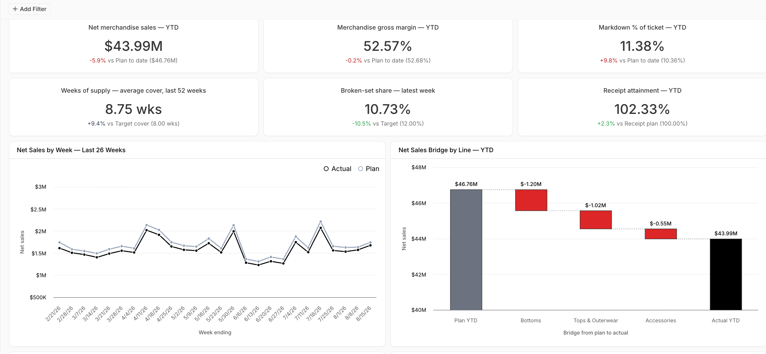 1. **Headline tiles:** Two rows of three. The top row is demand and margin; the bottom row is inventory health. Each tile carries its window in its title
2. **Trends:** The last 26 weeks of net sales and markdown rate, so a tile that's off shows when it went off
3. **Bridge:** Net sales by line from plan to actual. This is the chart that turns "we're behind" into "this line is behind."
4. **Rate by segment:** Gross margin rate by line, so a healthy company rate can't hide an unhealthy line
5. **Filters:** Business unit, channel and period, applied across every card
Every card names the view or query behind it in its config pane, and Summation validates every card, the layout, and the filters before the dashboard is shown.
## How it works
[Addison](/features/addison) takes you through a guided setup:
1. **Data:** Summation screens every candidate metric on whether it is final for the period, independently defined, and measured on the window a tile would show
2. **Metrics:** Summation suggests the metrics that passed, each with its window, threshold, and direction
3. **Layout:** Summation suggests the right layout to get actionable insights for your business
4. **Build and check:** Summation builds the dashboard and validates it before you see it: every card resolves to a real table or query, the tiles fit the grid, and each tab filter is confirmed to reach the cards it should. Dashboards do not carry a verification badge, since [verification](/features/artifacts/verification) covers reports, decks, Excel workbooks, and HTML pages. When you need a verified read on these same metrics to send to someone, ask Addison for a [report](/features/artifacts/reports) built from them
## What you need
| Data | Required? | What it adds |
| ---------------------------------------- | --------- | -------------------------------------------------------------------------------------------- |
| **Transactions at the level you review** | Yes | The headline tiles and trends |
| **Plan or targets** | Optional | Variance to plan on every tile and the bridge. Without it, tiles compare to the prior period |
| **Segment hierarchy** | Optional | The bridge by line and the rate-by-segment chart |
| **Thresholds with a defined window** | Optional | Colour on the tiles that share that window |
| **Inventory or capacity data** | Optional | The forward-constraint tiles |
Connect your [warehouse](/features/connectors) so the dashboard stays current. A file upload will build it, but the cards won't refresh until the data does.
## Make it yours
Drag, resize and reconfigure cards in Edit mode, or describe the change to Addison. Use the filters to narrow the dashboard to your business unit. To ask about any card or change it, use Ask or [Edit with AI](/features/artifacts/dashboards#build-and-edit) on the card. Keep your metric definitions in [Knowledge](/features/knowledge) so the dashboard, the weekly review and the deck all agree.
## Try it
**In Summation:**
* **Use the setup skill:** `/operational-dashboard`
* **Or follow the guided setup:** Get started → Choose a ready-made job → **Monitor operational performance** → Explore demo → **Create with my data**
**From another agent:** Open [summation.com/agents.md](https://summation.com/agents.md) and ask for an operational KPI dashboard.
## Next
Cards that refresh as your data changes.
What verification checks, and which artifacts get it.
Keep your metric definitions in one place.
The analyst that builds and edits your work.
1. **Headline tiles:** Two rows of three. The top row is demand and margin; the bottom row is inventory health. Each tile carries its window in its title
2. **Trends:** The last 26 weeks of net sales and markdown rate, so a tile that's off shows when it went off
3. **Bridge:** Net sales by line from plan to actual. This is the chart that turns "we're behind" into "this line is behind."
4. **Rate by segment:** Gross margin rate by line, so a healthy company rate can't hide an unhealthy line
5. **Filters:** Business unit, channel and period, applied across every card
Every card names the view or query behind it in its config pane, and Summation validates every card, the layout, and the filters before the dashboard is shown.
## How it works
[Addison](/features/addison) takes you through a guided setup:
1. **Data:** Summation screens every candidate metric on whether it is final for the period, independently defined, and measured on the window a tile would show
2. **Metrics:** Summation suggests the metrics that passed, each with its window, threshold, and direction
3. **Layout:** Summation suggests the right layout to get actionable insights for your business
4. **Build and check:** Summation builds the dashboard and validates it before you see it: every card resolves to a real table or query, the tiles fit the grid, and each tab filter is confirmed to reach the cards it should. Dashboards do not carry a verification badge, since [verification](/features/artifacts/verification) covers reports, decks, Excel workbooks, and HTML pages. When you need a verified read on these same metrics to send to someone, ask Addison for a [report](/features/artifacts/reports) built from them
## What you need
| Data | Required? | What it adds |
| ---------------------------------------- | --------- | -------------------------------------------------------------------------------------------- |
| **Transactions at the level you review** | Yes | The headline tiles and trends |
| **Plan or targets** | Optional | Variance to plan on every tile and the bridge. Without it, tiles compare to the prior period |
| **Segment hierarchy** | Optional | The bridge by line and the rate-by-segment chart |
| **Thresholds with a defined window** | Optional | Colour on the tiles that share that window |
| **Inventory or capacity data** | Optional | The forward-constraint tiles |
Connect your [warehouse](/features/connectors) so the dashboard stays current. A file upload will build it, but the cards won't refresh until the data does.
## Make it yours
Drag, resize and reconfigure cards in Edit mode, or describe the change to Addison. Use the filters to narrow the dashboard to your business unit. To ask about any card or change it, use Ask or [Edit with AI](/features/artifacts/dashboards#build-and-edit) on the card. Keep your metric definitions in [Knowledge](/features/knowledge) so the dashboard, the weekly review and the deck all agree.
## Try it
**In Summation:**
* **Use the setup skill:** `/operational-dashboard`
* **Or follow the guided setup:** Get started → Choose a ready-made job → **Monitor operational performance** → Explore demo → **Create with my data**
**From another agent:** Open [summation.com/agents.md](https://summation.com/agents.md) and ask for an operational KPI dashboard.
## Next
Cards that refresh as your data changes.
What verification checks, and which artifacts get it.
Keep your metric definitions in one place.
The analyst that builds and edits your work.