A dashboard (.sdash) is a live, interactive view of your data — a bento-grid canvas of cards (charts, KPIs, tables, and more) that stays up to date as the underlying data changes. A dashboard can hold multiple tabs, each its own canvas of cards. Dashboards are an artifact and live inside a project.
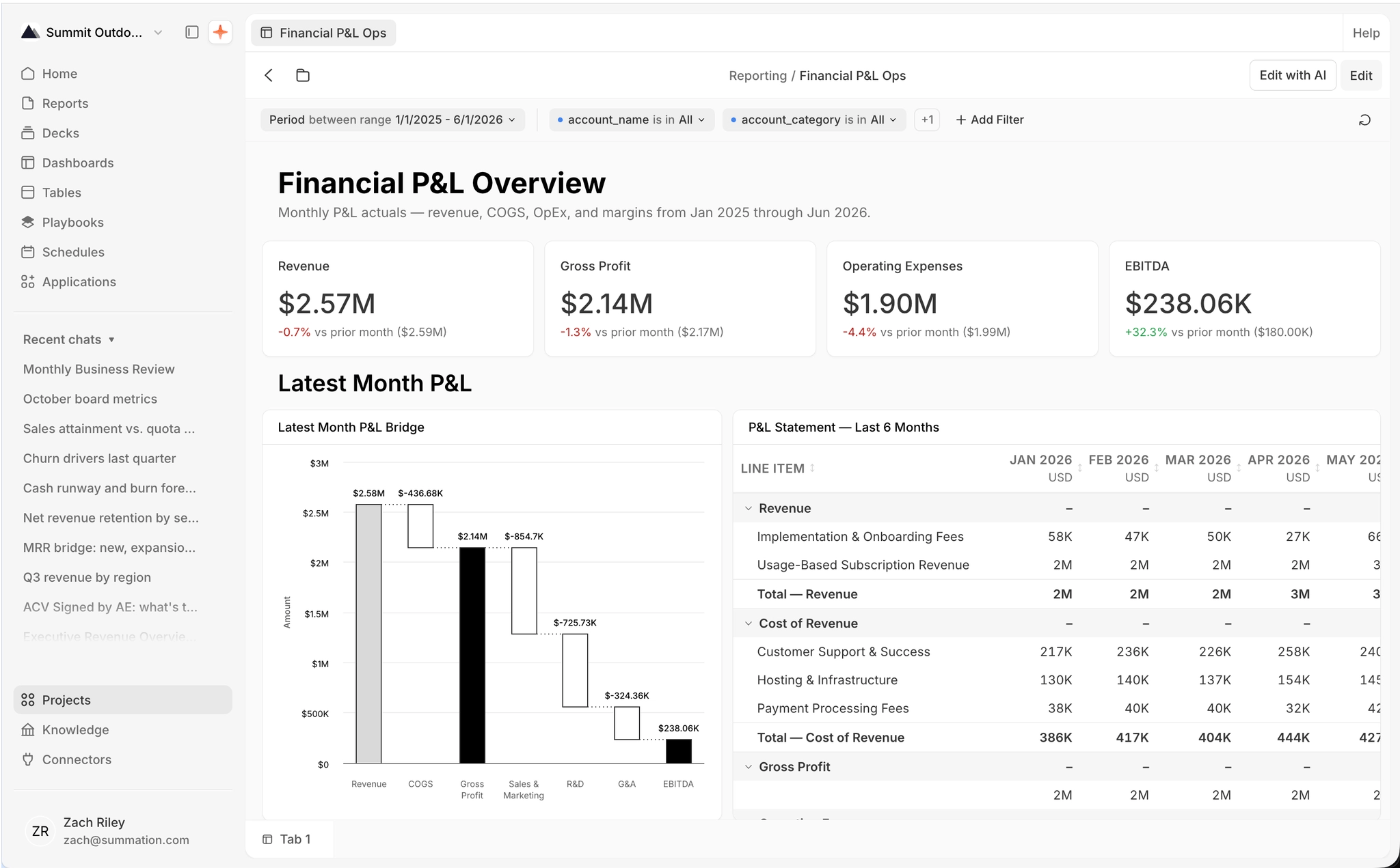
An example dashboard titled 'Olympic Countries Review' on a bento grid, under the breadcrumb 'My Project / Olympics Players and Country Review'. A filter bar (Season is in Summer +1, Name is in All, Add Filter) runs across the top, with Edit with AI and Edit buttons at the top-right. Below are four KPI cards (Total medals awarded 39K, Competing countries (NOCs) 230, Unique athletes 135K, Games held 51), a bar-chart card (Top 15 countries by total medals, led by USA at 5.6K) and a table card (Country medal breakdown with NOC, Gold, Silver, and Bronze columns). A 'Trends & Sports' section follows with a line chart (Medals over time — top 5 countries) and a bar chart (Top 10 sports by total medals, led by Athletics). Countries and Athletes tabs sit at the bottom.

An example dashboard: KPI, chart, and table cards on a bento grid

Create a dashboard

Start a dashboard from Dashboards (/dashboards) → Create (top-right), from a project’s Create → Dashboard, or from the editor’s empty state. Two ways to build it:
  • Start with Addison — describe what you want (e.g. “Revenue by region”, “Headcount trends”) and Addison assembles the dashboard, streaming it live, the same way it creates a report.
  • Start from scratch — a blank canvas you build yourself, card by card.
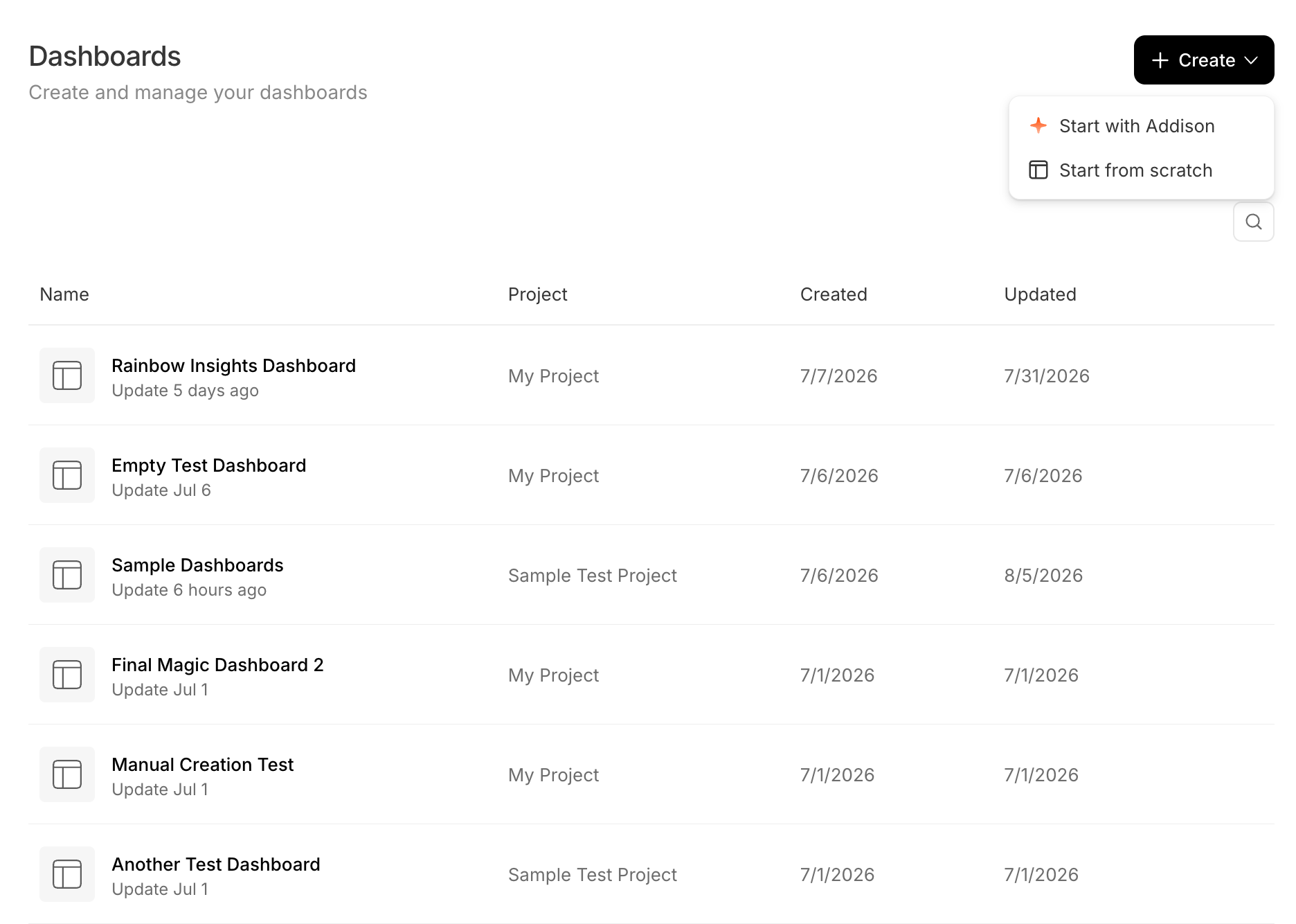
The Dashboards page at /dashboards ('Create and manage your dashboards'), with a Create dropdown open showing 'Start with Addison' and 'Start from scratch'. Below is a table of dashboards across projects with Name, Project, Created, and Updated columns.

The Dashboards page and its Create menu
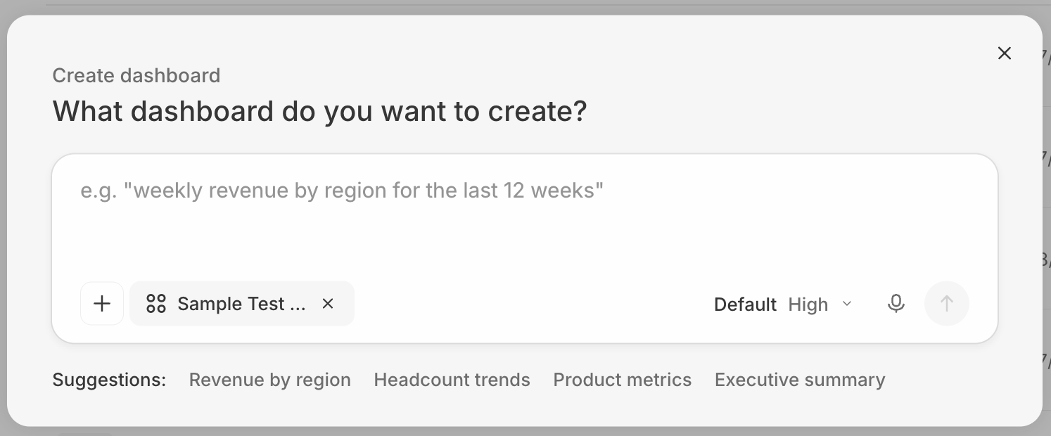
A 'Create dashboard' modal asking 'What dashboard do you want to create?', with a prompt field (placeholder 'weekly revenue by region for the last 12 weeks'), a project chip, and suggestion chips: Revenue by region, Headcount trends, Product metrics, and Executive summary.

Start with Addison

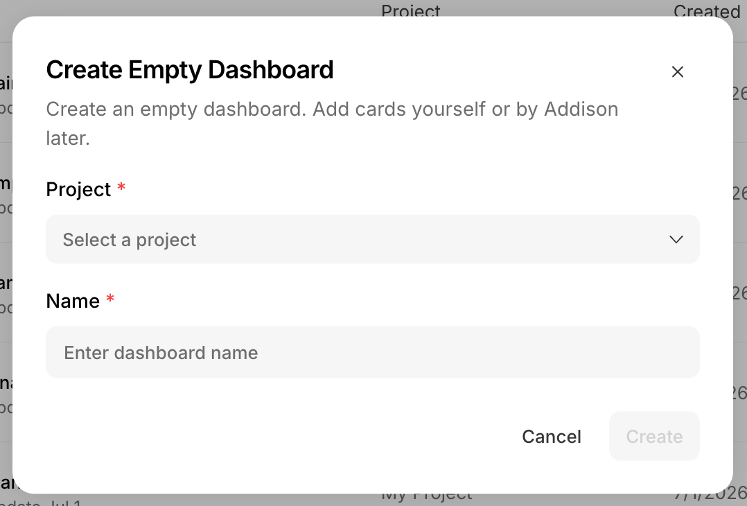
A 'Create Empty Dashboard' modal that reads 'Create an empty dashboard. Add cards yourself or by Addison later.', with a Project selector, a Name field, and Cancel and Create buttons.

Start from scratch

Two more ways: from a project’s Create → Dashboard (see Create artifacts from project), or by asking Addison in a chat (see Creating artifacts).

Find and open dashboards

The Dashboards page (/dashboards, shown above) lists your dashboards across all projects (Name, Project, Created, Updated) with search. Click one to open its editor. Dashboards are .sdash folder packages, so they also appear in their project’s file browser.

Data sources

A dashboard’s data sources are the data tables it draws from. Open the Data Sources panel in the edit toolbar to add and manage them; it lists them under Tables and SQL Queries. Every data source you add becomes a selectable option when you configure a card’s data, and its columns become available as filter options.
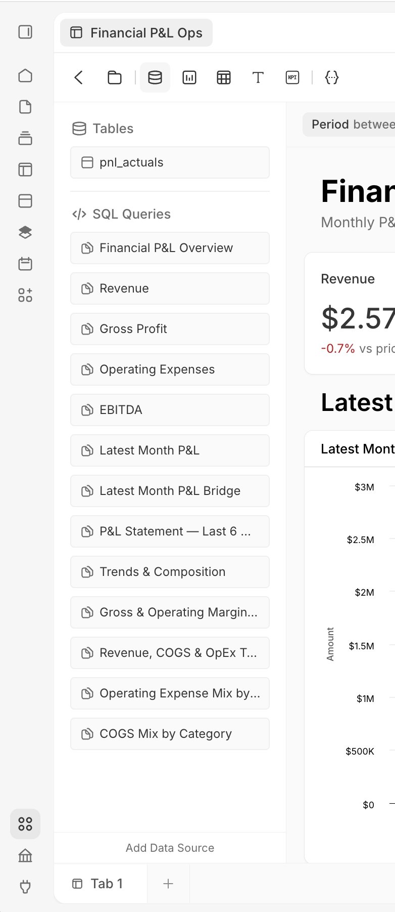
The Data Sources panel in the dashboard edit toolbar, grouped into 'Tables' (olympics_event) and 'SQL Queries' (heading-countries-main, Total medals awarded, Competing countries (NO…), Unique athletes, Games held, Country medal breakdow…, heading-countries-trends, Medals over time — top 5 …, Top 10 sports by total me…).
The Data Sources panel

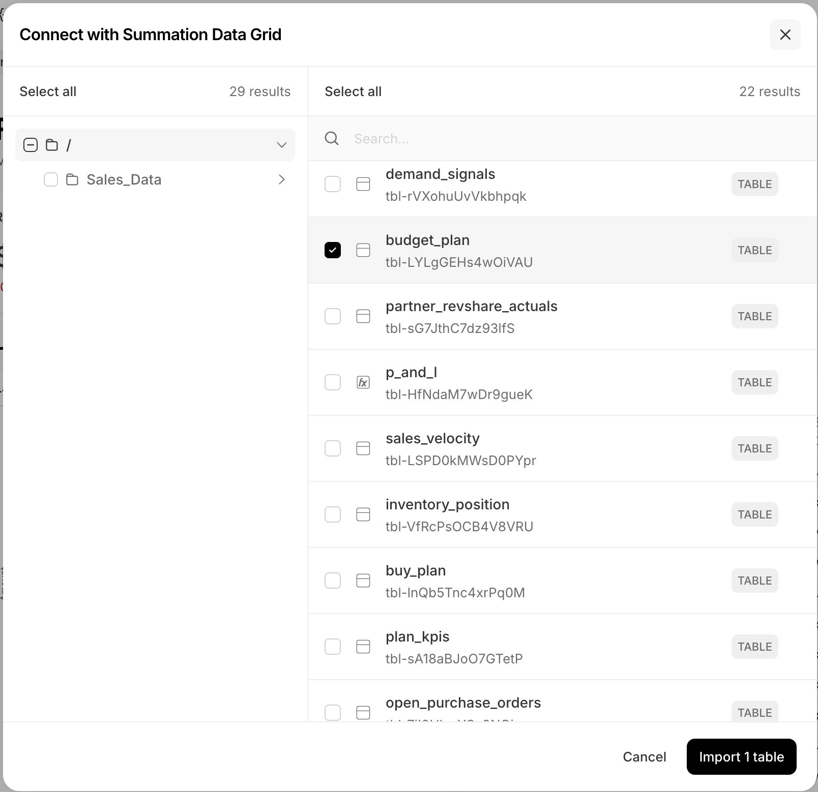
A 'Connect with Summation Data Grid' modal with a two-pane folder and table browser. The left pane shows a folder tree (ZR Playground, Simon_testcvs, Simon Playground, DW Test, Olympic Demo Data, bq_test, DEMO_WH) with 88 results; the right pane lists tables each tagged TABLE (netsuite_customers2 and mf_poc_stg_order_lines_enriched checked, plus olympics_event, top_sales_by_category_wow_mom, netsuite_invoices, mf_poc_src_order_lines, netsuite_customers4, shopify_orders), with a search box, Select all, 79 results, and Cancel and Import 2 tables buttons.

Add a table from the Summation Data Grid

Data sources come in two kinds:
  • View data sources are backed by Summation’s view layer — a structured, declarative definition of a card’s data (its tables, columns, filters, and aggregations) that the config pane can read and edit. Summation built it so cards can be configured and filtered in the UI without writing SQL. Cards you add and configure manually use a view data source by default.
  • SQL data sources run a raw query that bypasses the view layer — more flexible, but less human-configurable. Addison can generate both and tends to use SQL most of the time. On a card backed by a SQL data source you can still edit the Card Type, Title, Style, and its Filter behavior; only the underlying query is off-limits (the Data Source row is marked Read Only), so only Addison can change what data it returns.

Cards

A dashboard is a grid of cards:

Build and edit

Click Edit to enter edit mode, then:
  • Add cards — open a palette from the toolbar (Add Chart / Table / KPI / Text, plus Data Sources) and drag a card onto the grid. Dropping a card auto-sources its data and auto-configures it with the best-matching setup; you can also drag a data-source table straight onto the grid to build a chart from it. Cards you add manually always use a view config (backed by a data view).
  • Arrange — drag to move and use the resize handles; the layout is a 12-column bento grid.
  • Act on a card — select a card to reveal its toolbar (Ask, Edit, and ); Edit opens the config pane.
  • Save — edits are saved explicitly with Save; Undo and Cancel (discard) are available.
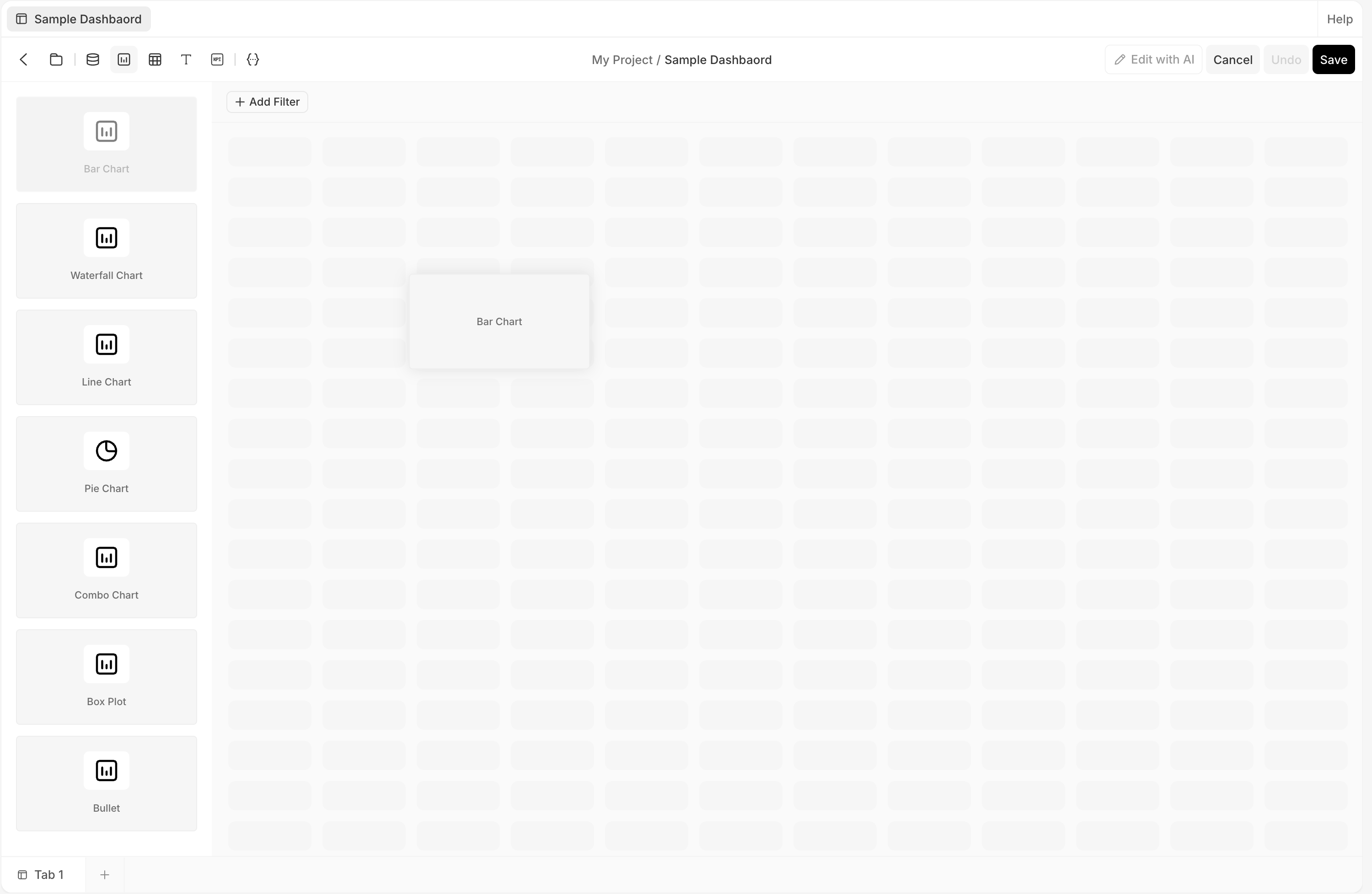
Dashboard edit mode. The left palette lists chart types (Bar Chart, Waterfall, Line, Pie, Combo, Box Plot, Bullet) and a Bar Chart card is being dragged onto the empty bento grid. The toolbar has Data Sources, Chart, Table, Text, KPI, and JSON icons; the top-right shows Edit with AI, Cancel, Undo, and Save.

Edit mode: drag a card from the palette onto the bento grid

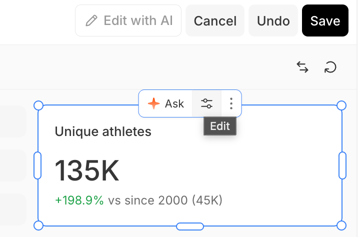
A selected KPI card ('Unique athletes', 135K, +198.9% vs since 2000 (45K)) in dashboard edit mode with resize handles. Its toolbar shows Ask, an Edit (sliders) button that opens the config pane, and a More (⋯) button; the top-right of the editor has Edit with AI, Cancel, Undo, and Save.

A selected card in edit mode, with its toolbar

Configure a card

Select a card in edit mode and open its config pane (the right rail) from the card’s Edit button. The pane has three tabs:
  • Data — the data source (a view) and how it’s shaped: Select View, row and column pivots, value, filter, and sorting.
  • Config — the card itself: Card Type, title, data mapping (value column, comparison), and number format.
  • Style — presentation: title, color scheme, orientation, legend, axes, and formats (for chart and non-pivoted table cards).
Cards on a view data source are fully editable. On a card on a SQL data source, only the Data Source row of the Data tab is marked Read Only (only Addison can change its query); the tab still exposes an editable Filter behavior control, and the card’s Config (Card Type, Title) and Style stay editable.
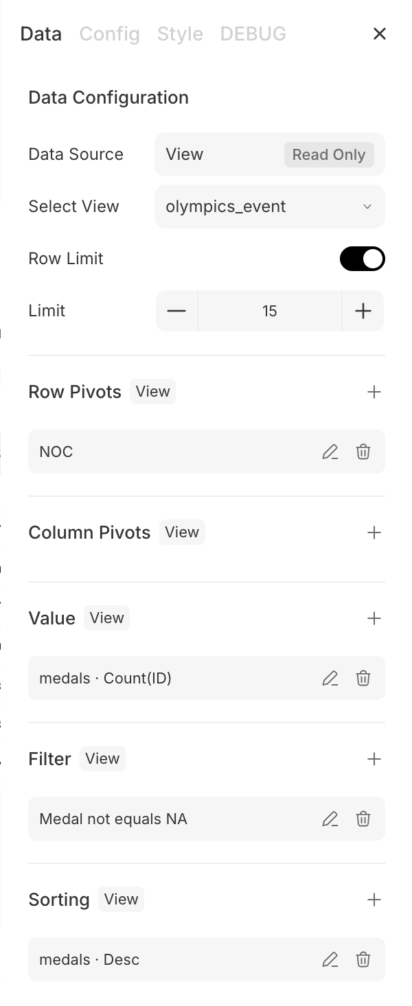
The card config pane's Data tab ('Data Configuration'). Data Source is 'View' marked Read Only; Select View is 'olympics_event'; a Row Limit toggle set to 15; and collapsible sections, each with a View badge — Row Pivots (NOC), Column Pivots, Value (medals · Count(ID)), Filter (Medal not equals NA), and Sorting (medals · Desc).

Data

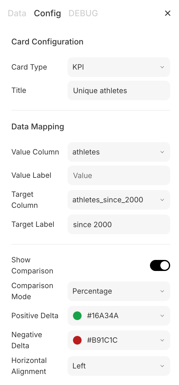
The card config pane's Config tab ('Card Configuration'). Card Type is KPI, Title 'Unique athletes'; a Data Mapping section with Value Column 'athletes', Value Label, Target Column 'athletes_since_2000', and Target Label 'since 2000'; a Show Comparison toggle, Comparison Mode 'Percentage', Positive Delta (#16A34A) and Negative Delta (#B91C1C) color swatches, and Horizontal Alignment 'Left'.

Config

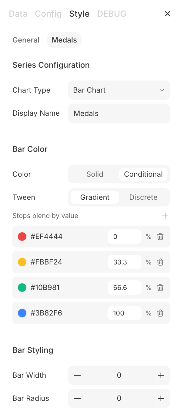
The card config pane's Style tab, with General and Medals sub-tabs (Medals selected). A Series Configuration section sets Chart Type 'Bar Chart' and Display Name 'Medals'; a Bar Color section with Solid/Conditional and Gradient/Discrete toggles and color stops that blend by value (#EF4444 at 0%, #FBBF24 at 33.3%, #10B981 at 66.6%, #3B82F6 at 100%); and a Bar Styling section with Bar Width and Bar Radius steppers.

Style

Ask and edit with Addison

Dashboards aren’t edited by typing. Select a card for its toolbar and pick:
  • Ask — ask Addison a question about that card; the answer streams in the chat pane.
  • Edit with AI — enter AI-edit mode, then select cards and describe the change you want. Edits queue in a bar (“N edits”), and Submit sends them to Addison as one request, which applies them to the dashboard.
A KPI card ('Competing countries (NOCs)', 230, +9.5% vs since 2000 (210)) selected in view mode on the 'Olympic Countries Review' dashboard, showing a floating toolbar with Ask, an Edit (sliders) button, and a More (⋯) button; the 'Total medals awarded' card (39K) sits alongside.

Select a card to Ask or Edit with AI
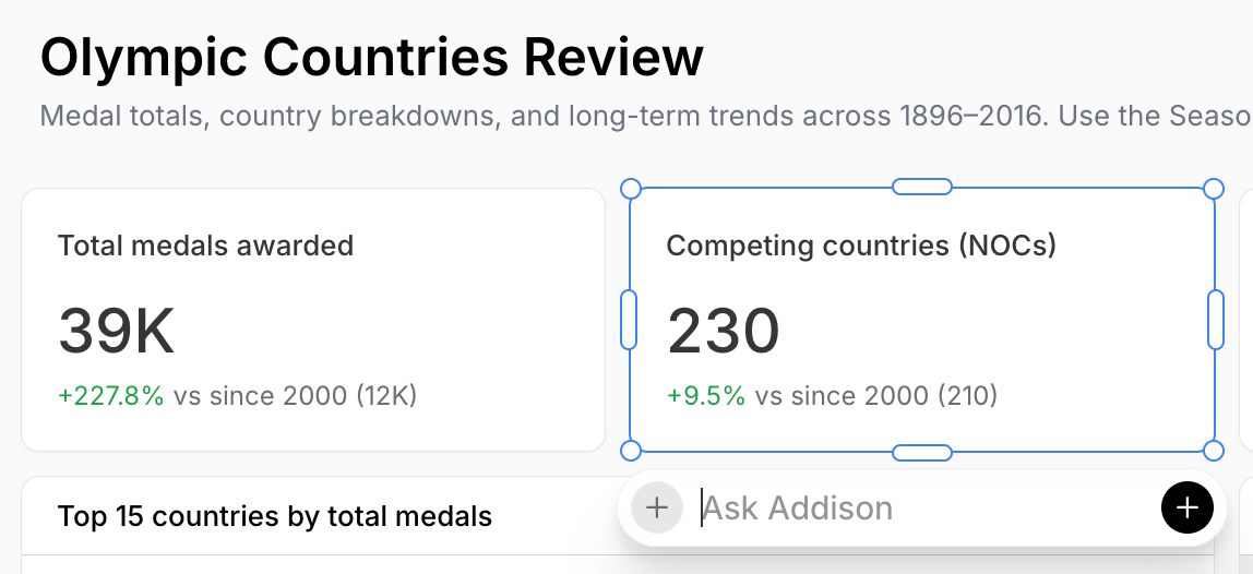
An 'Ask Addison' input box appearing below the selected 'Competing countries (NOCs)' KPI card on the 'Olympic Countries Review' dashboard, with a + button to add context.

Ask — question a card

Dashboard 'Olympic Countries Review' in AI-edit mode: a selected 'Competing countries (NOCs)' card shows an edit thread with the comment 'Can you center the content in this card for me?' and Remove and Close actions, plus a '1 edit' bar with Discard and Submit at the bottom of the screen.

Edit with AI — queue edits, then Submit

Filters

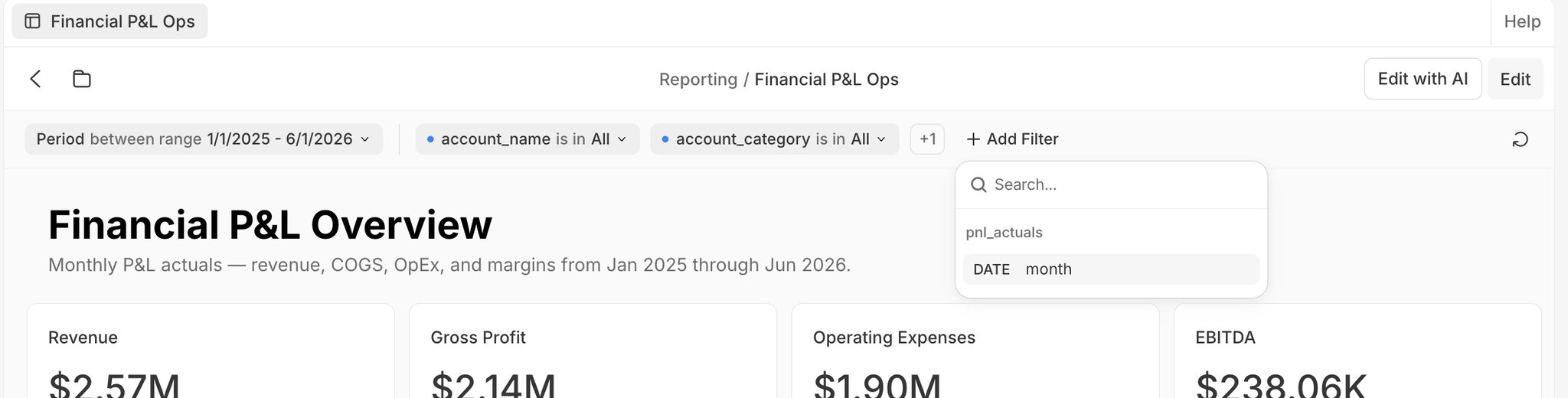
A filter bar above the grid filters every card at once. Click Add Filter, pick a column, then choose an operator and values. See Appendix B for filter types and operators. Filters behave differently in the two modes:
  • View mode — apply a temporary filter for exploration. It shows a blue dot in front and lasts for your session; to keep it, switch to edit mode and Save. The bar collapses overflow filters into a +N dropdown.
  • Edit mode — add, remove, and Pin filters (a pinned filter stays out front and isn’t collapsed). The reorder button at the right of the bar rearranges filters; pinned filters reorder only among pinned, and unpinned only among unpinned. Save to persist.
  • Cross-filtering — click a data point in a chart to filter the other cards to that selection.
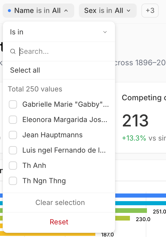
A discrete filter for 'Name' open in the filter bar. The operator is 'Is in'; there is a search box and 'Select all'; a checklist of sample values out of 250 total (Gabrielle Marie 'Gabby'…, Eleonora Margarida Jos…, Jean Hauptmanns, Luis ngel Fernando de l…, Th Anh, Th Ngn Thng); and Clear selection and Reset at the bottom.

A discrete filter — searchable multi-select

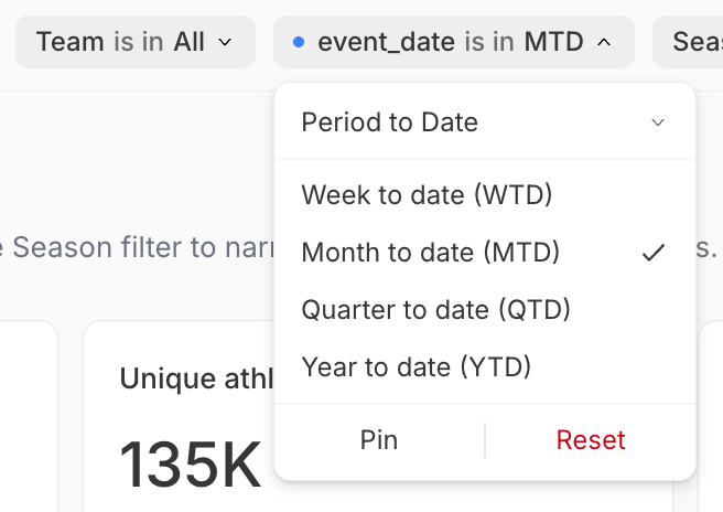
A date filter ('event_date is in MTD') open with a 'Period to Date' operator and presets: Week to date (WTD), Month to date (MTD, selected), Quarter to date (QTD), and Year to date (YTD); plus Pin and Reset.

A date filter — Period to Date presets

The dashboard filter bar with several filters: 'Season is in Summer +1', 'Name starts with A' marked with a blue dot as a temporary filter, 'Sex is in All', a '+3' collapsed group, and an 'Add Filter' button whose column picker (for the olympics_event table) lists fields with type badges — ID (INT), Age, Height, Weight, and NOC (STR), Year (INT), then City, Sport, Event, and Medal (STR).

The filter bar: a temporary filter (blue dot), a +N collapse, and Add Filter

Download

Dashboards download at the card level: from a card’s More (⋯) menu, Save image / Copy image (PNG) or Save data / Copy data (CSV). You can also Save the whole tab as an image. Dashboard-wide PDF export isn’t available yet.
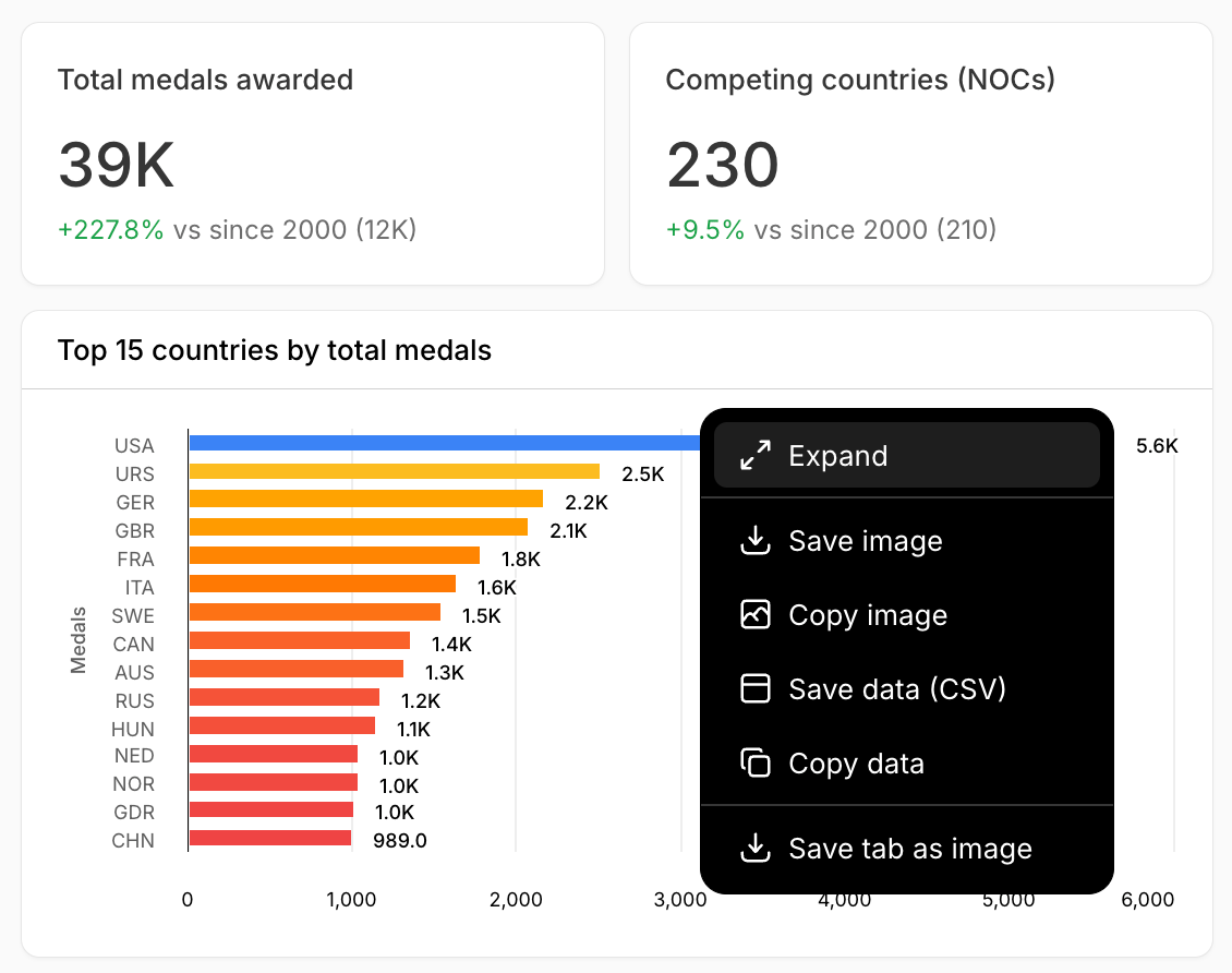
A dashboard card's More (⋯) menu open, with Expand, Save image, Copy image, Save data (CSV), Copy data, and Save tab as image.

A card's More menu — Expand and download options

Rename, duplicate, and delete

A dashboard is a .sdash folder package (a directory on disk with a single file ID). Rename, duplicate, or delete it from the file browser’s menu, or from the row on the Dashboards page (Open in new tab, Rename, Duplicate, Delete). Deleting can’t be undone.
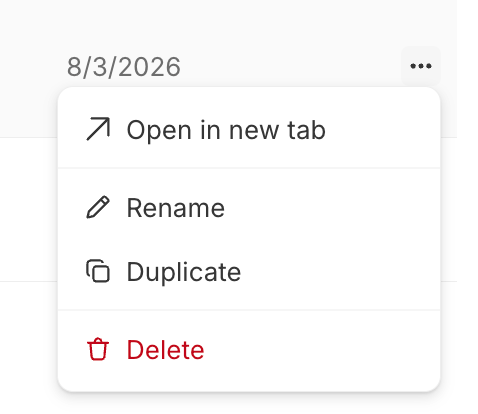
A dashboard row's ⋯ menu on the Dashboards page: Open in new tab, Rename, Duplicate, and Delete (in red).

A dashboard's row menu on the Dashboards page

Share and publish

Publishing a dashboard as a view-only link isn’t available yet. For now, dashboards are viewed in the app by project collaborators. (Reports do support publishing.)

Appendix A: configurable options by card type

Everything below is set in the card config pane. All data-backed cards share the same Data tab and some common Config controls; the per-type specifics follow.
View-backed cards:SQL-backed cards instead show Filter behavior (Replace or Intersect) — how tab filters combine with the card’s own query.
Config tab (no Style tab):
Config (data mapping)Style → GeneralStyle → per series
Config (flat tables; hidden when pivoted)Style (flat tables only, per column)
Config (hidden when pivoted)Style (flat reports only, per column)
Config only (no Data or Style tab):

Appendix B: dashboard filters

Add a filter from Add Filter, then pick a column. The operators available depend on the column’s data type; the default is a date range for date columns and a multi-select (Is in) for everything else. Choose an operator and provide its input.
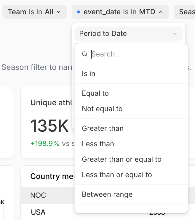
A date filter's operator dropdown with 'Period to Date' selected at the top, a search box, and a list below: Is in, Equal to, Not equal to, Greater than, Less than, Greater than or equal to, Less than or equal to, and Between range.

A date filter's operators